From the first word to the full stop
Challenge
SLOVA is a publishing house in Almaty that turns what experts already have — talks, posts, years of client work — into books. Since 2022 it has released more than 110 titles, from business books to family histories.
The brand had to feel unlike a traditional publisher — no academic gravity, no bookish clichés — and speak with intellect, taste and confidence. At the same time it had to work as a small imprint mark on spines and back covers next to other publishers' logos, and carry a website that sells the service to authors.
Solution
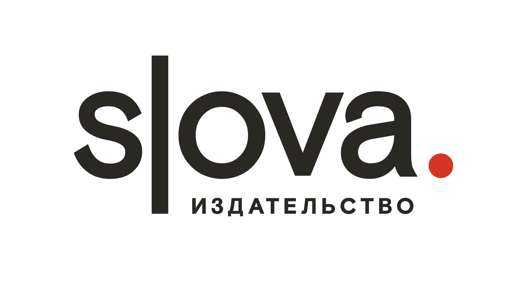
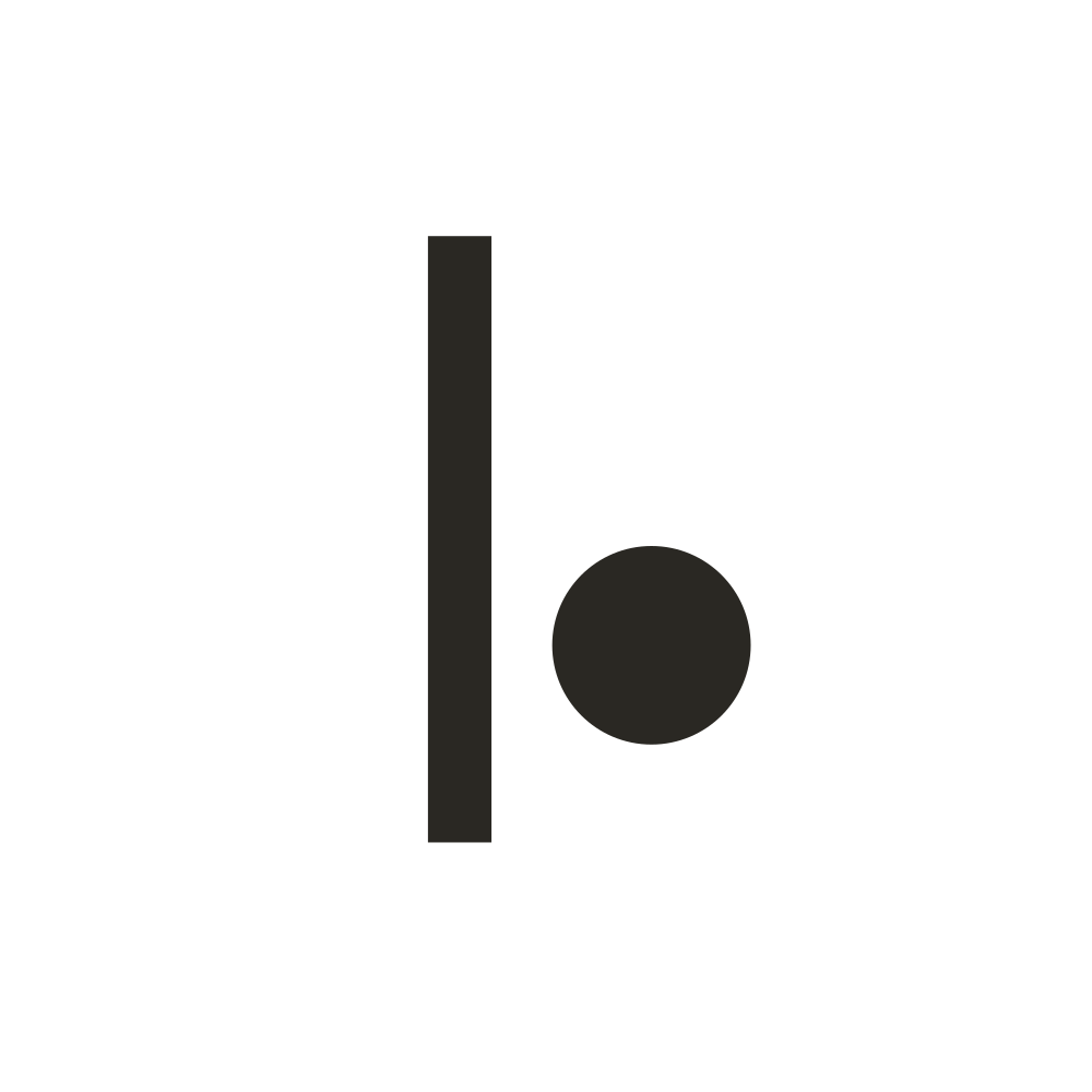
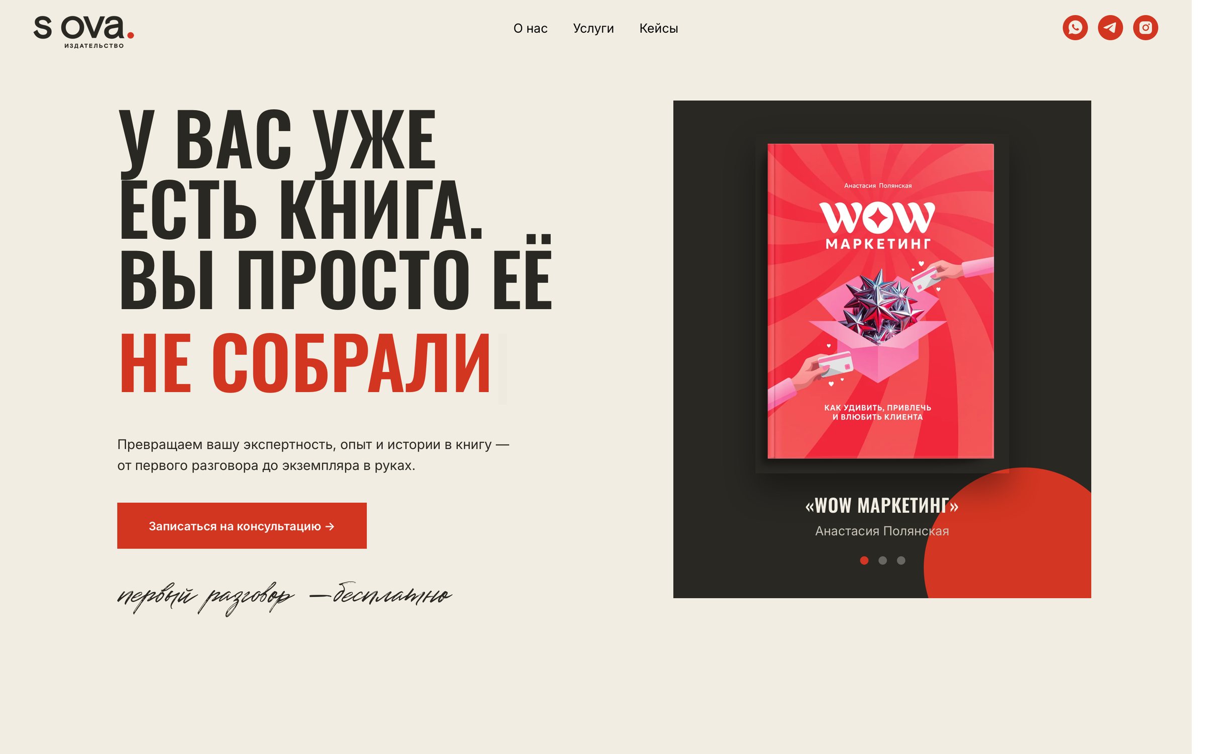
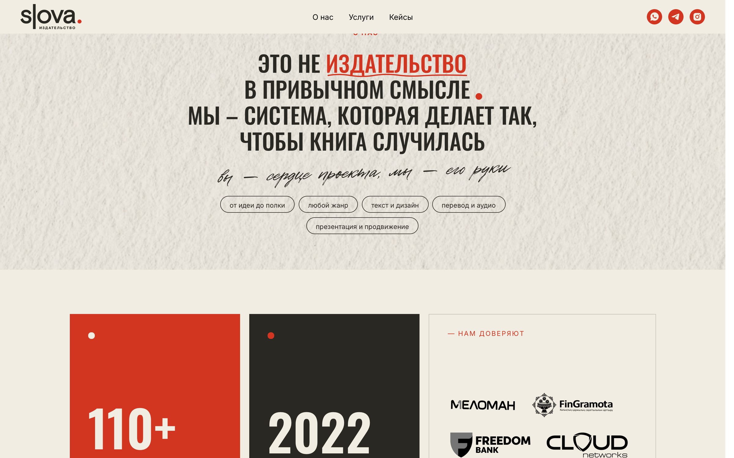
A lowercase wordmark in which a text cursor replaces the letter l and a red full stop closes the word. The cursor is text in progress; the dot is text brought to the end — the whole service in one sign. On screen the cursor blinks every 530 ms, as if the logo were being typed.
Around it: a cursor-and-dot symbol for favicons, avatars and spines, a "Paper and ink" palette with fixed roles, and a type system of condensed headlines, a neutral text face and handwritten notes in the margins.
ROLE & RESPONSIBILITIES:
Lead Brand & Visual Designer
Brand identity · Web design · Print
Website: idslova.com



Website
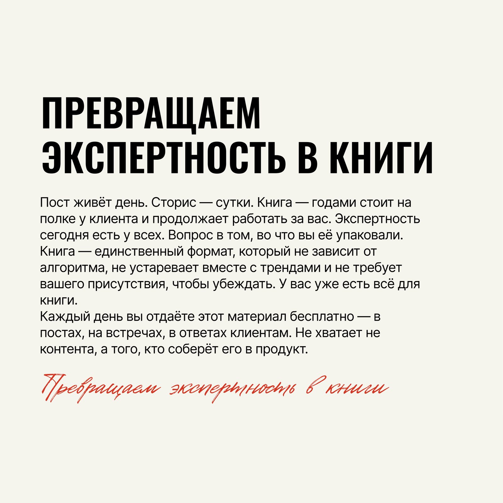
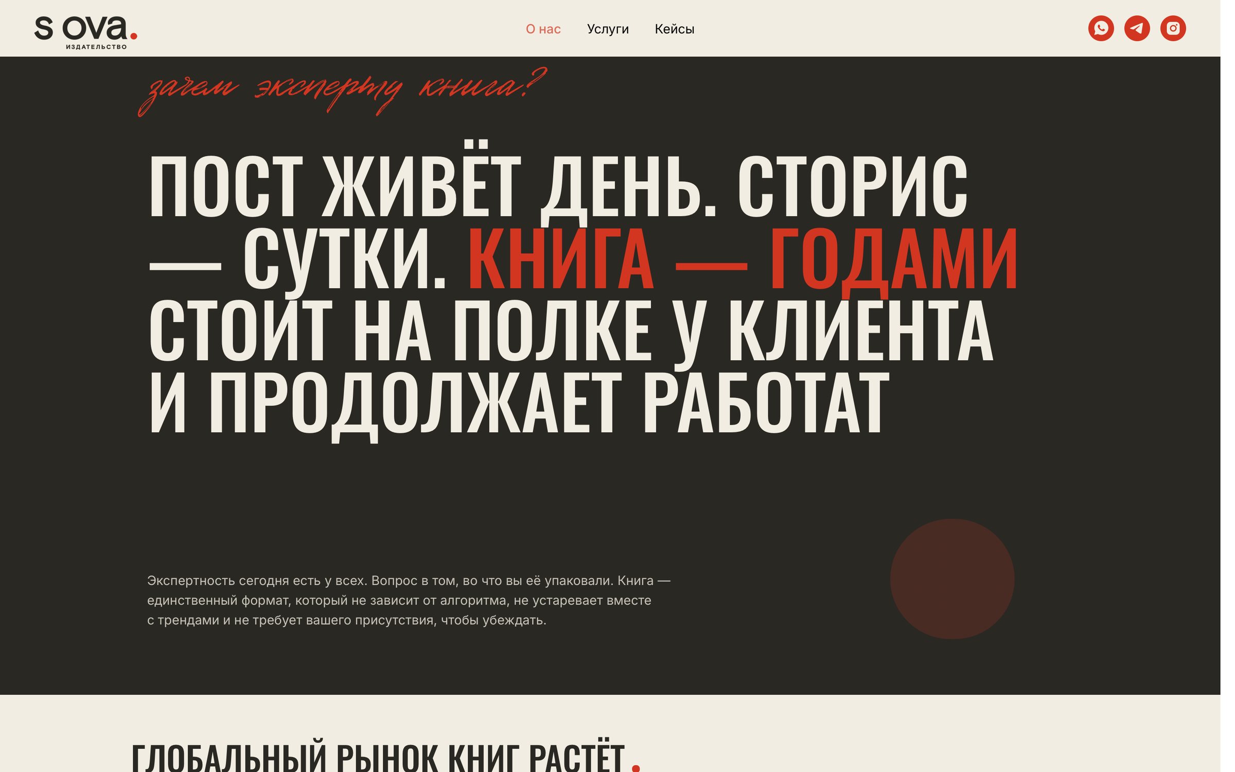
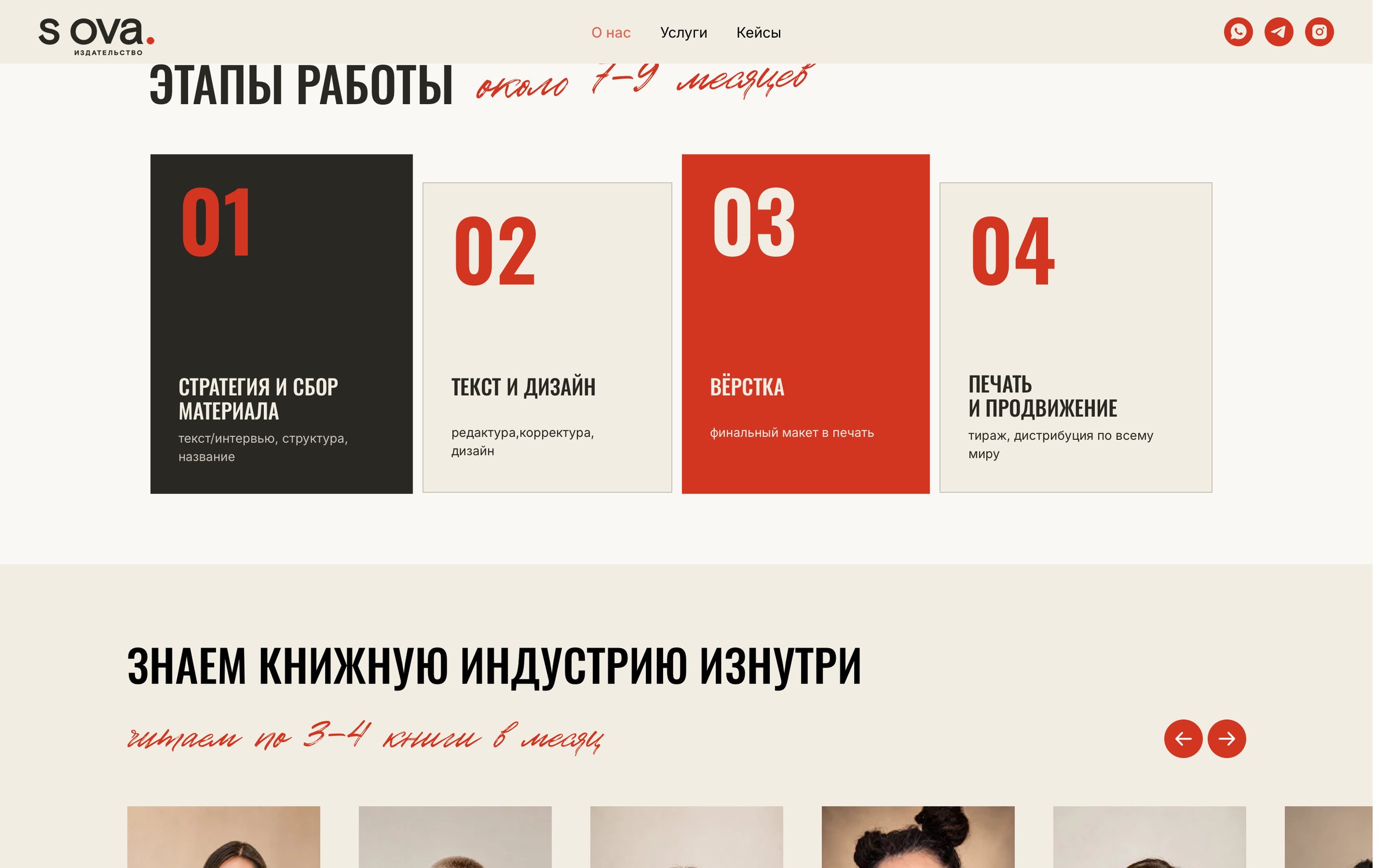
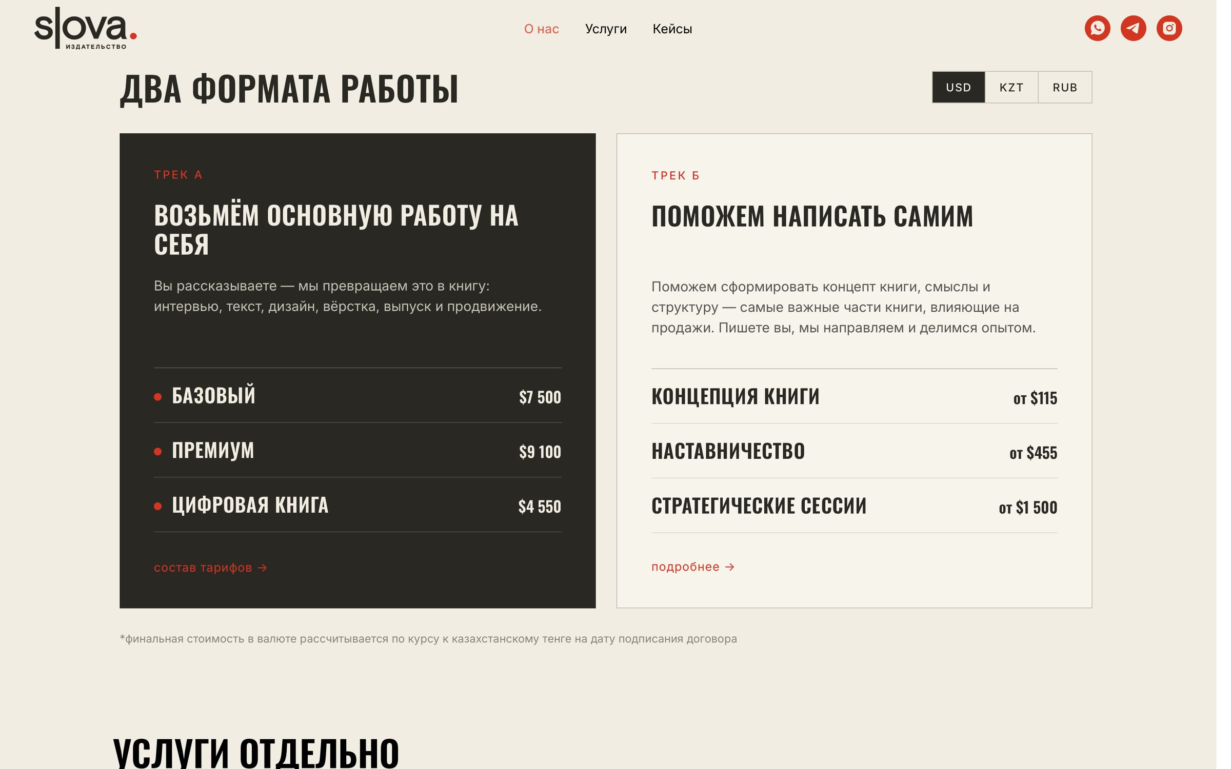
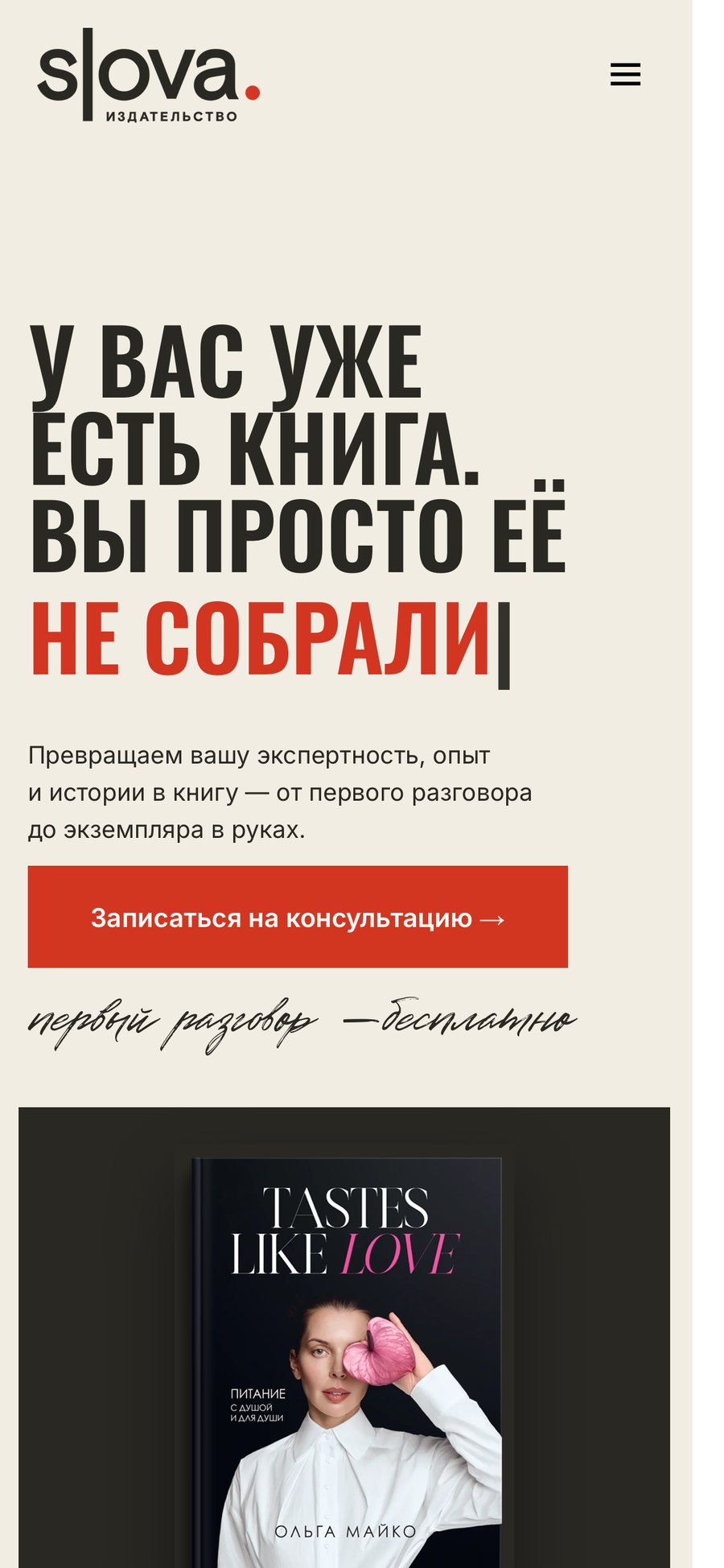
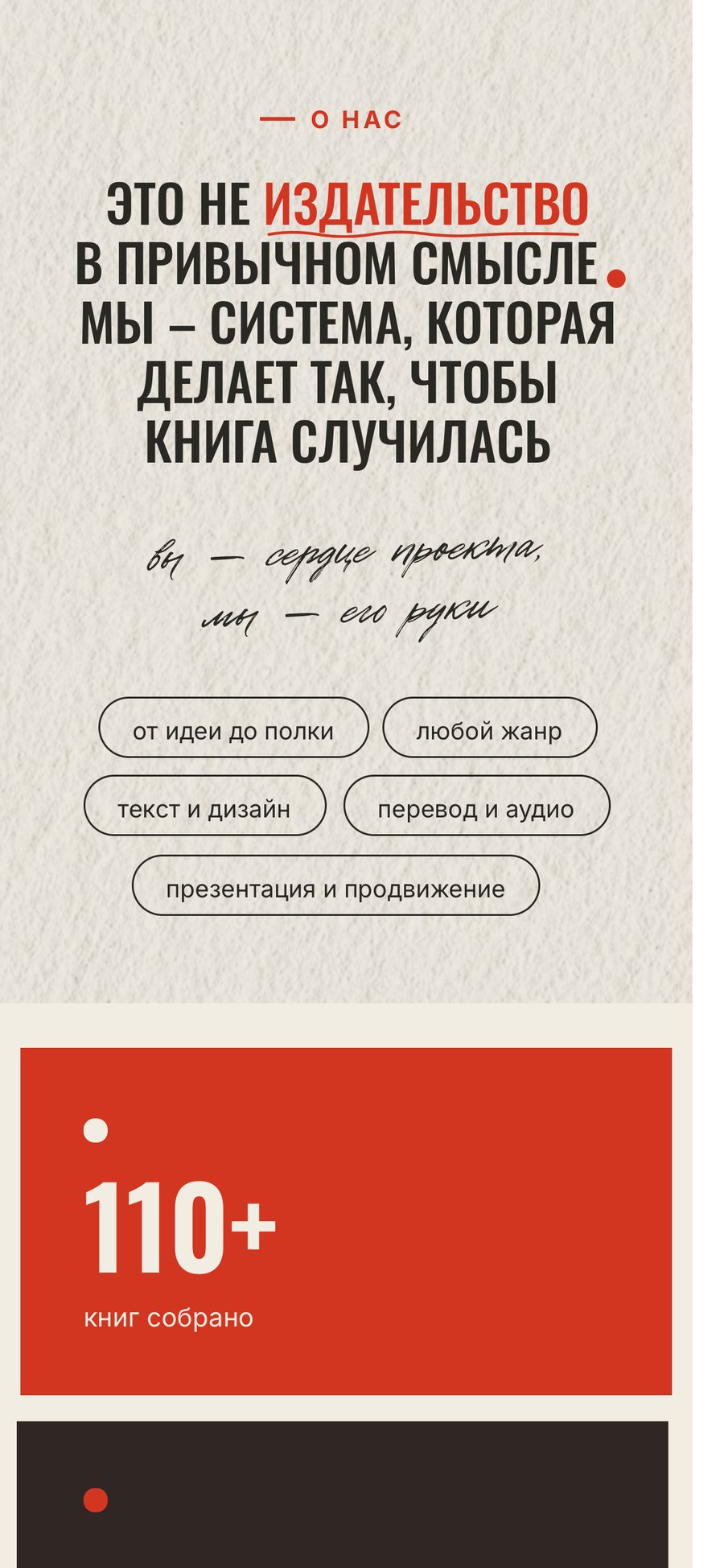
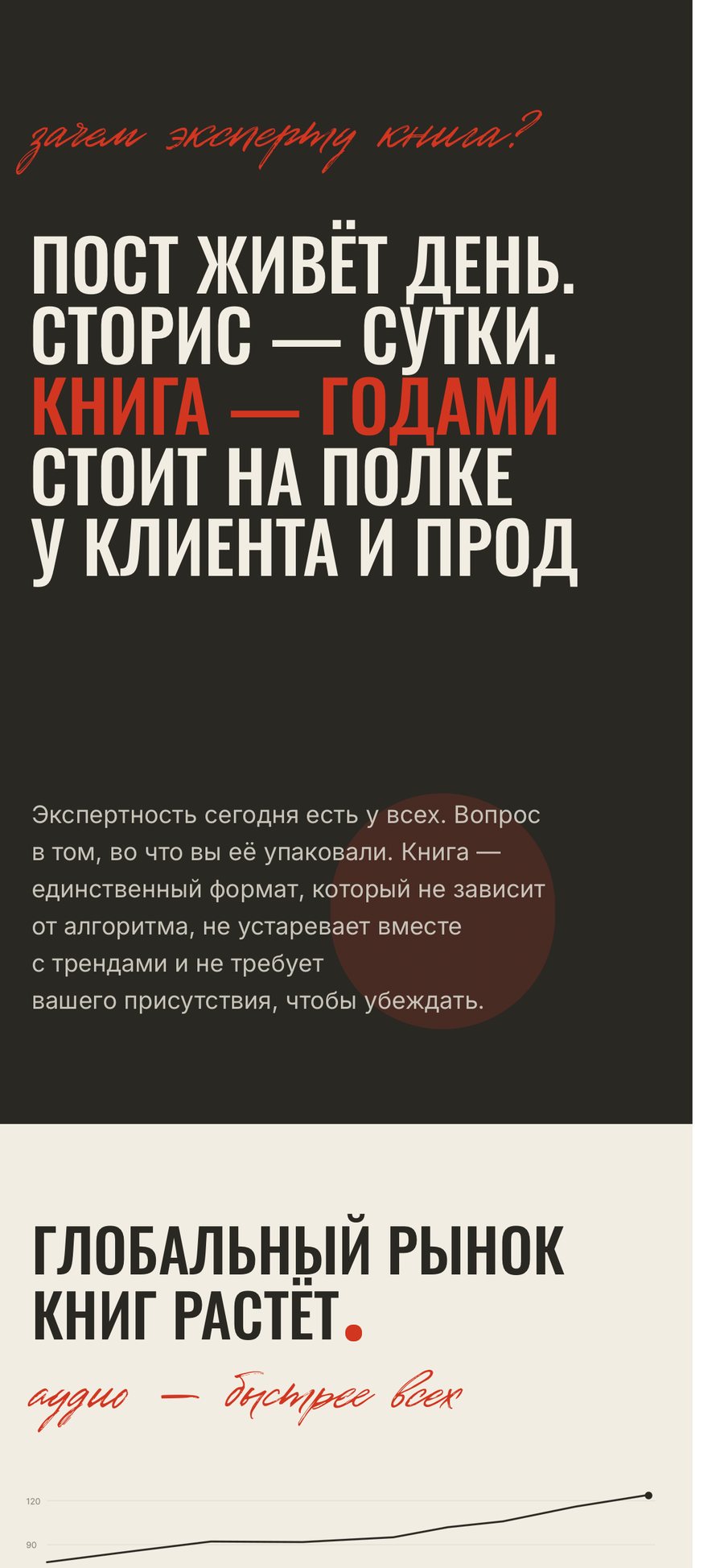
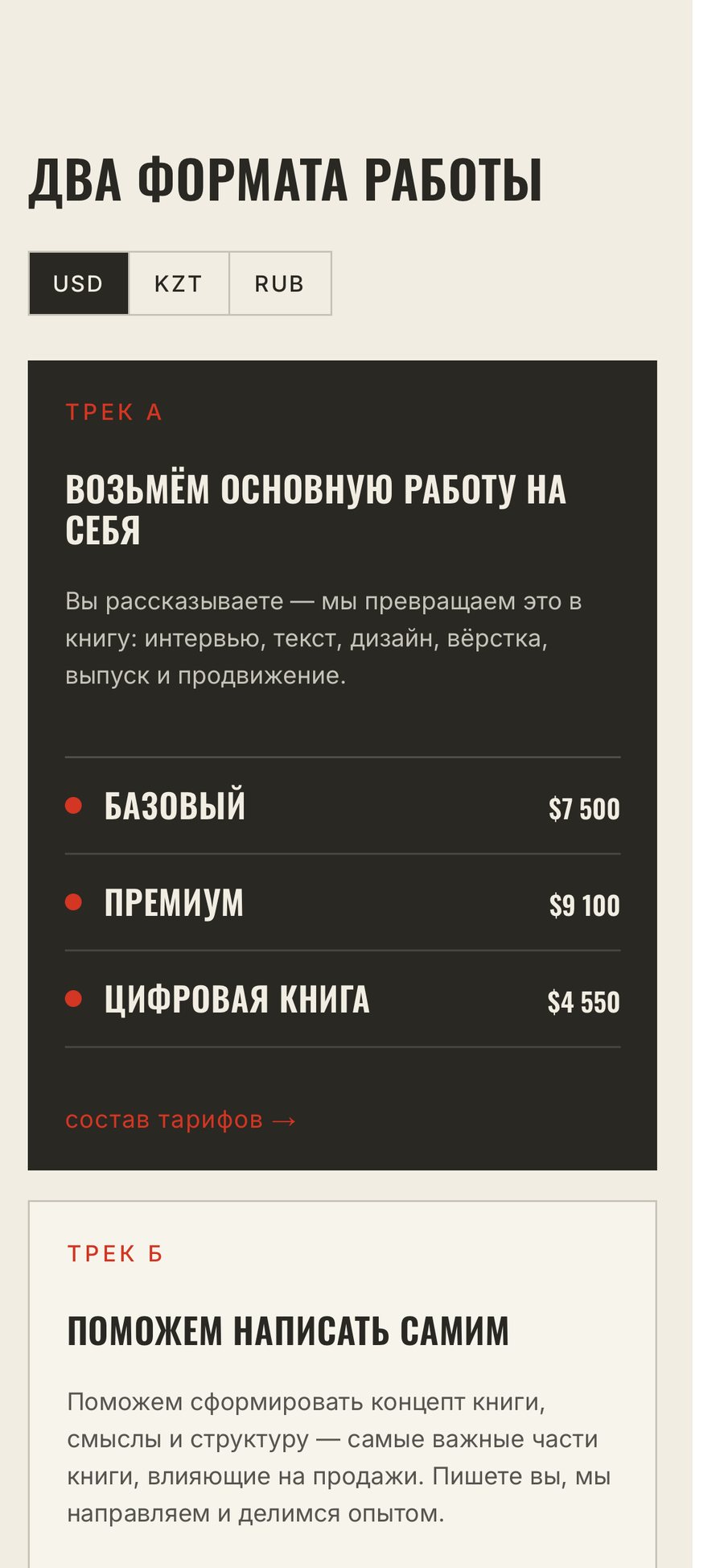
The landing page speaks to experts, not readers, and is built as an argument: a promise — "You already have a book. You just haven't put it together" — then a manifesto, proof in real covers and numbers, why a book outlasts a post, the 7–9 month process, two ways to work and the full price list.
The cursor from the logo types the headline, warm paper replaces white, and red is kept for the one thing that matters on each screen.
On the shelf and in hand
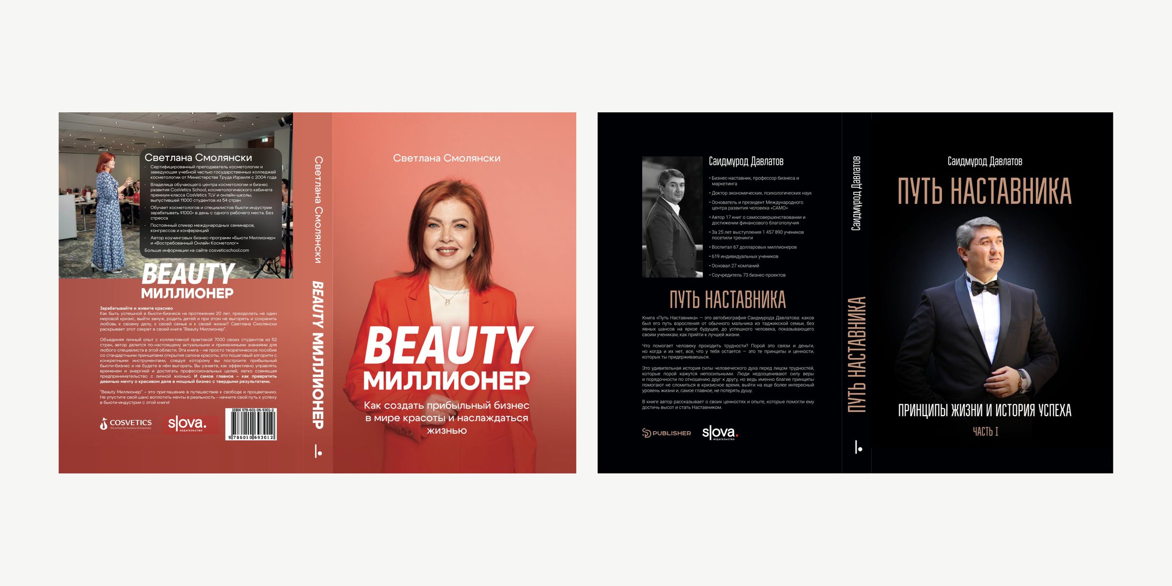
On books the full logo sits in the row of publisher marks on the back cover, aligned by height with partner logos, and the symbol marks the foot of the spine. The red dot stays wherever the cover allows it; on red and busy covers the logo goes single-colour.
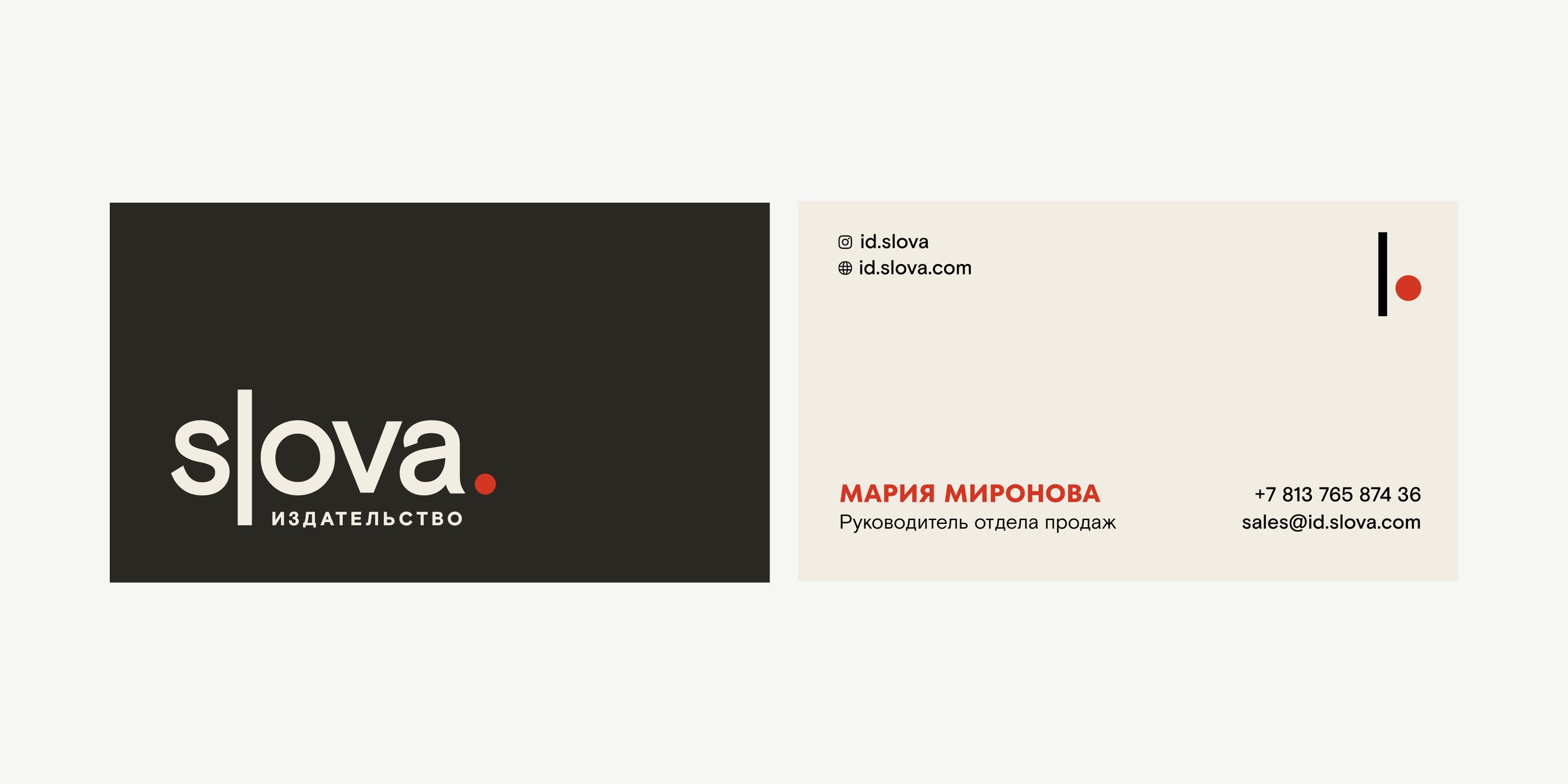
Business cards are printed on textured warm-white stock: the logo on the front, contacts on the back, red only for the name and the dot.