A coastline written into one letter

Challenge
PT Long Happy Life is building a residential complex on Jelenga Bay in West Sumbawa — a quieter coast than Bali, with hills, surf and long empty beaches.
The developer had a name but no brand. It needed an identity that reads as a home rather than a resort or an investment product, earns the trust of buyers who cannot yet visit the place, and works on everything from a sales folder to a website.
Solution
I started with research — market and competitor analysis, audience profiles and brand personality — and then developed three logo concepts.
In the chosen direction the N of LONG becomes the symbol: two soft waves locked into a letter, like a coastline or the curve of a roof. The symbol repeats into a pattern, and the system rests on calm materials — TT Firs Neue for headlines, Suisse Intl for text, and a palette named after the place: Ocean, Sand, Sky and Stone.
ROLE & RESPONSIBILITIES:
Brand Strategist & Lead Designer
Brand strategy · Brand identity · Web design · Print
Website: lhl-development.com


Ocean · Primary
Sand · Background
Sky · Pattern & accents
Stone · Text
Tested before launch
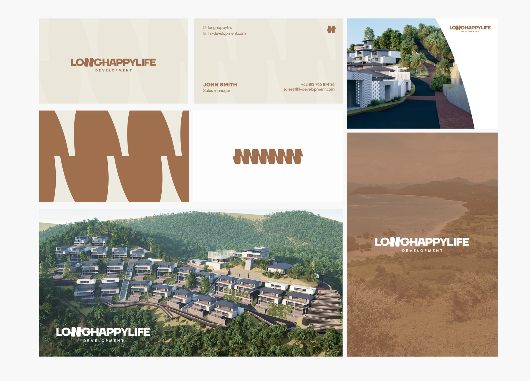
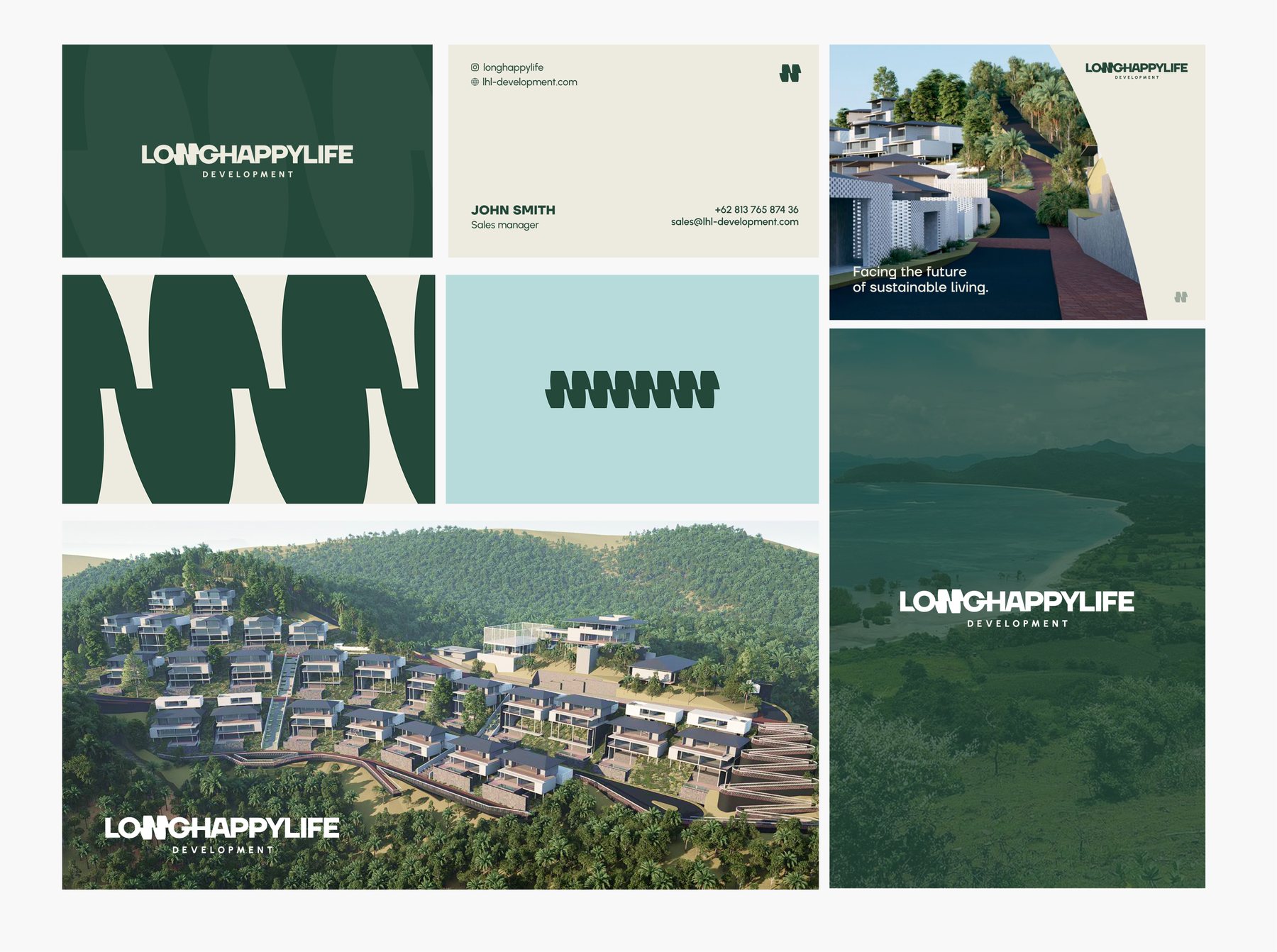
Before rolling the identity out, I tested it with people from the target audience — most of them 35–44, specialists and freelancers, and more than half had bought or considered buying property. Two colour directions were shown in real applications — terracotta and forest green — and a clear majority chose green.
The visual language worked, but the N alone scored lowest on memorability. So in the final system the symbol became the lead element of every layout, while the pattern is used sparingly, as an accent rather than a background. A later update moved the palette from forest green to ocean blue, closer to the bay.
Symbol first
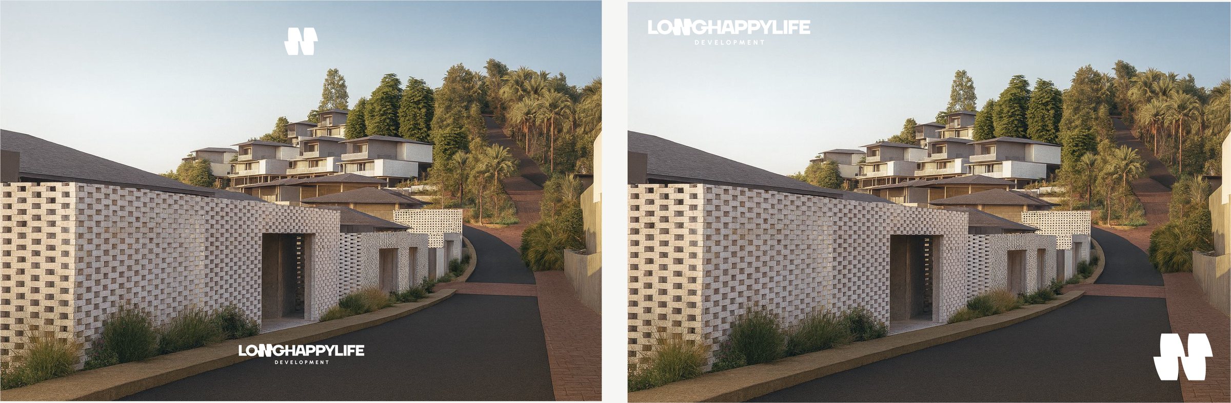
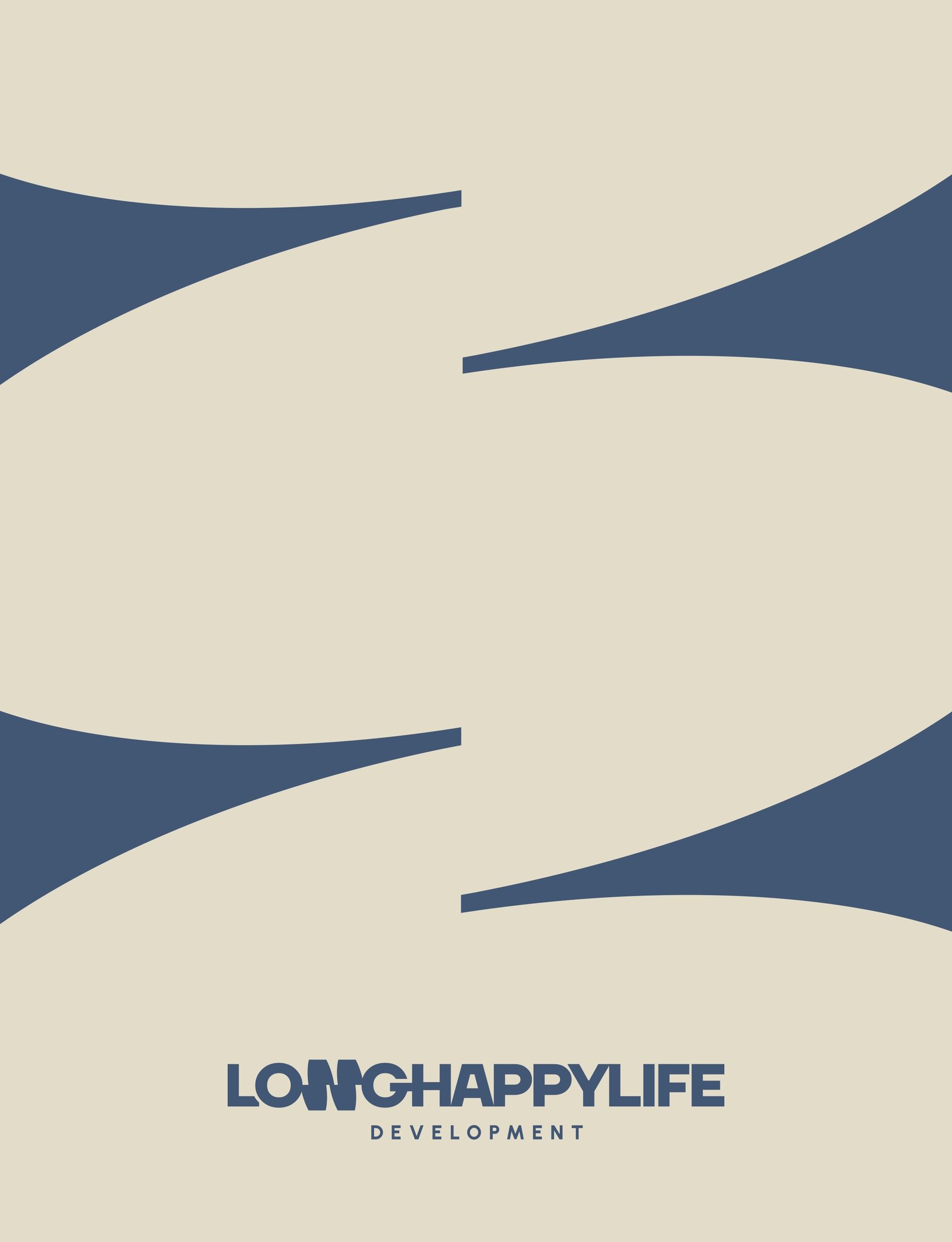
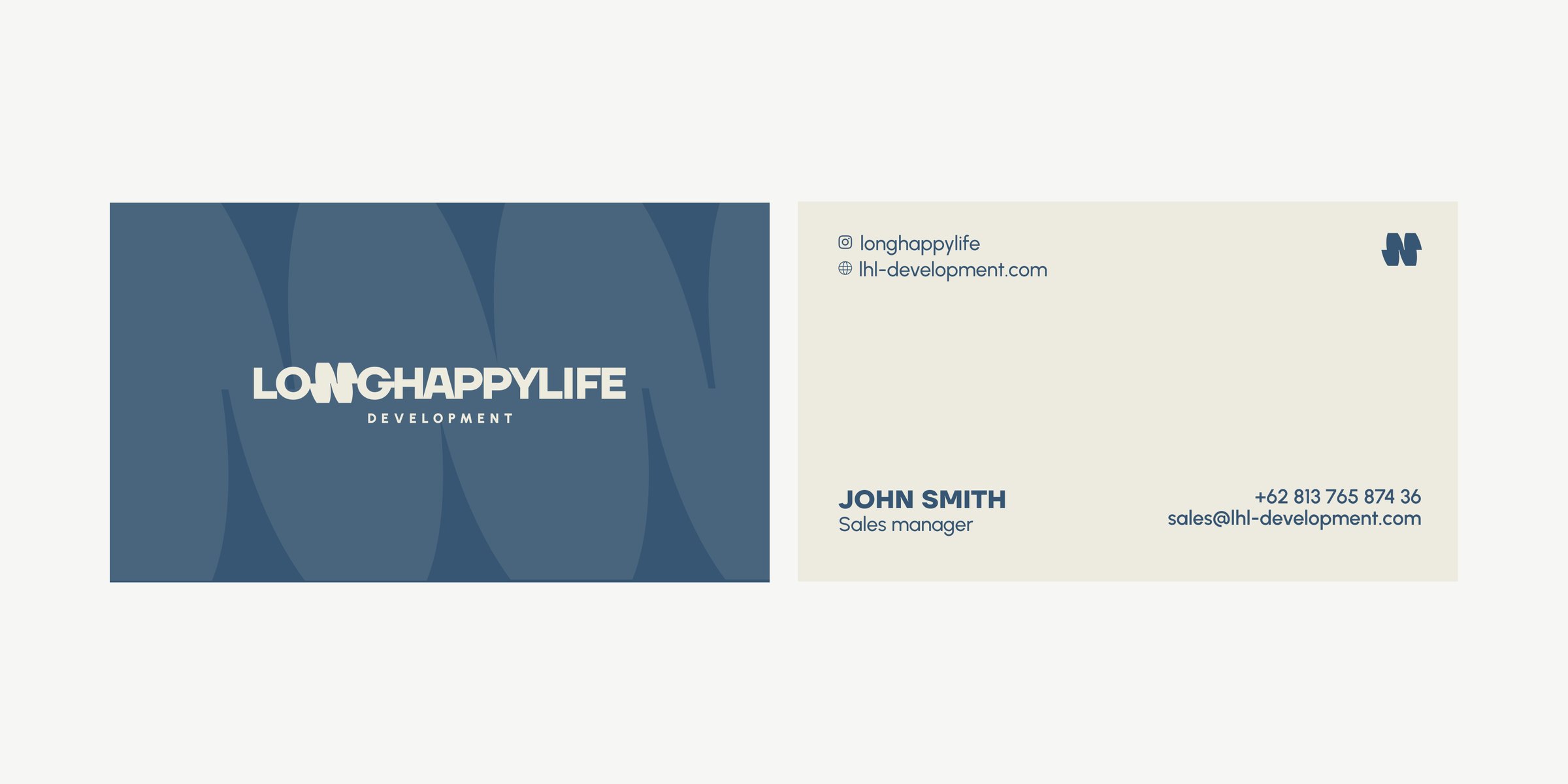
On renders the N works as a signature on its own. The sales folder opens with the symbol on Ocean and unfolds into the pattern on Sand. Business cards are meant for embossing over the wave pattern on textured warm off-white stock.
Website
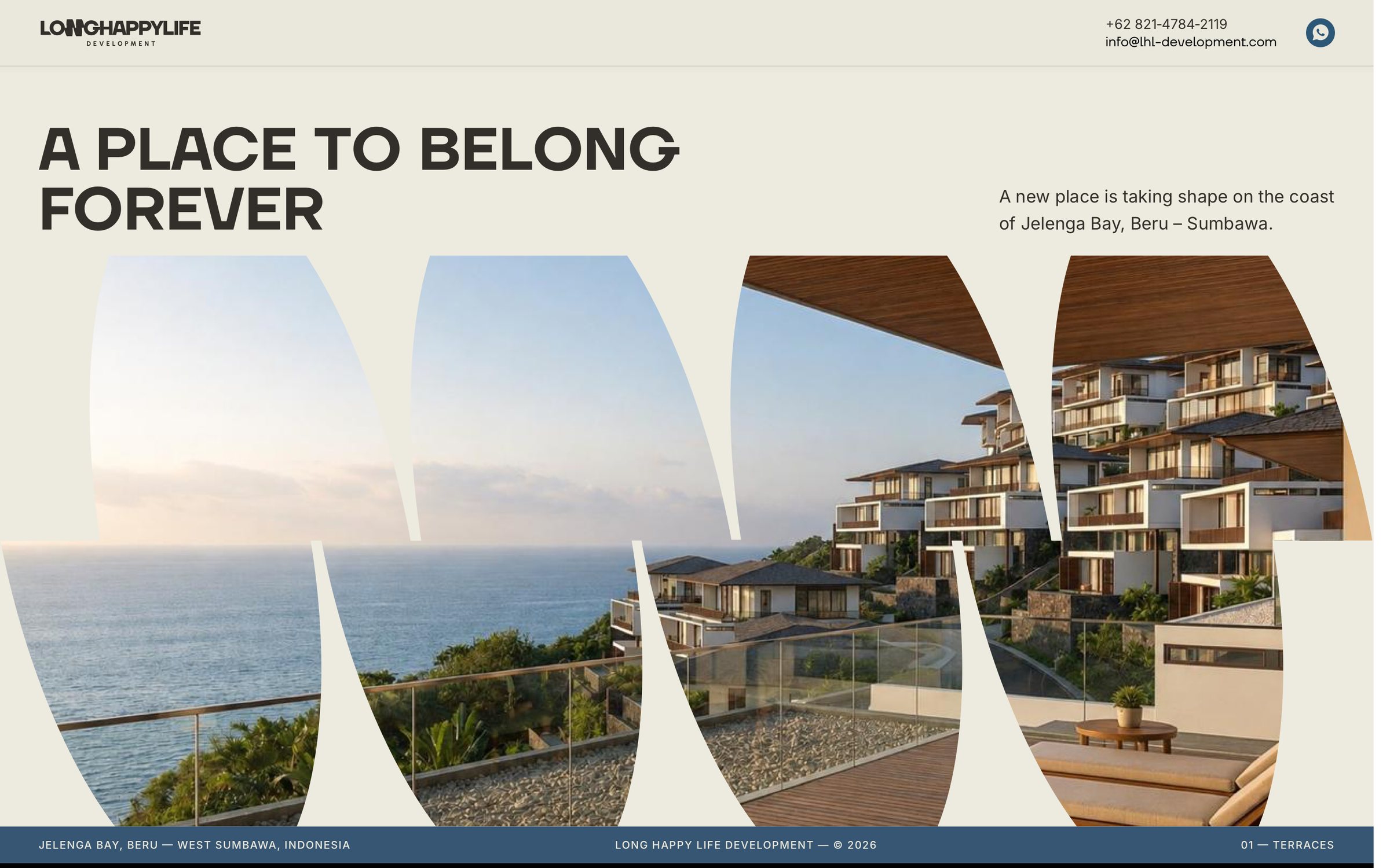
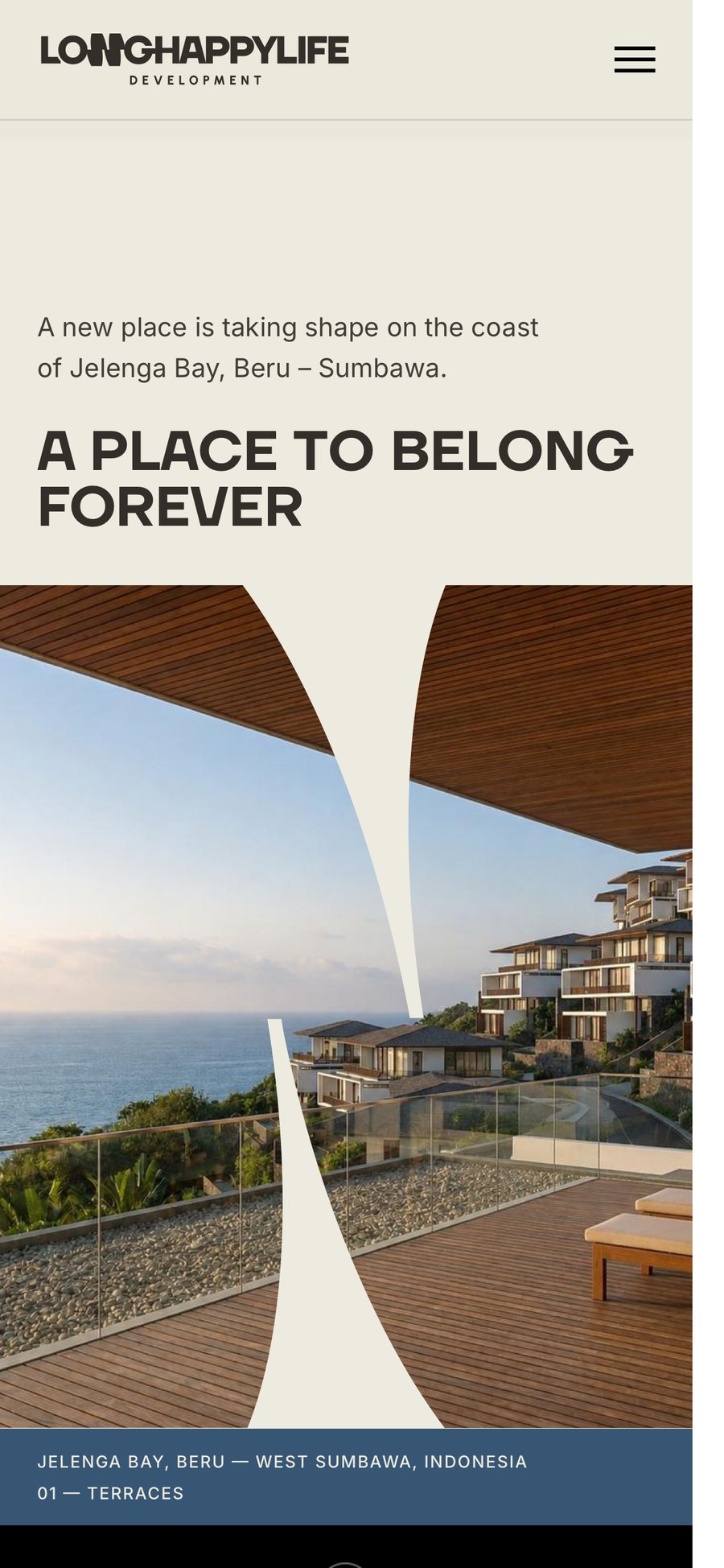
The first version of the website is a single statement screen for a project still under construction: "A place to belong forever", with views of the future terraces seen through the waves of the N.