Building a scalable
real estate brand in Bali

The challenge
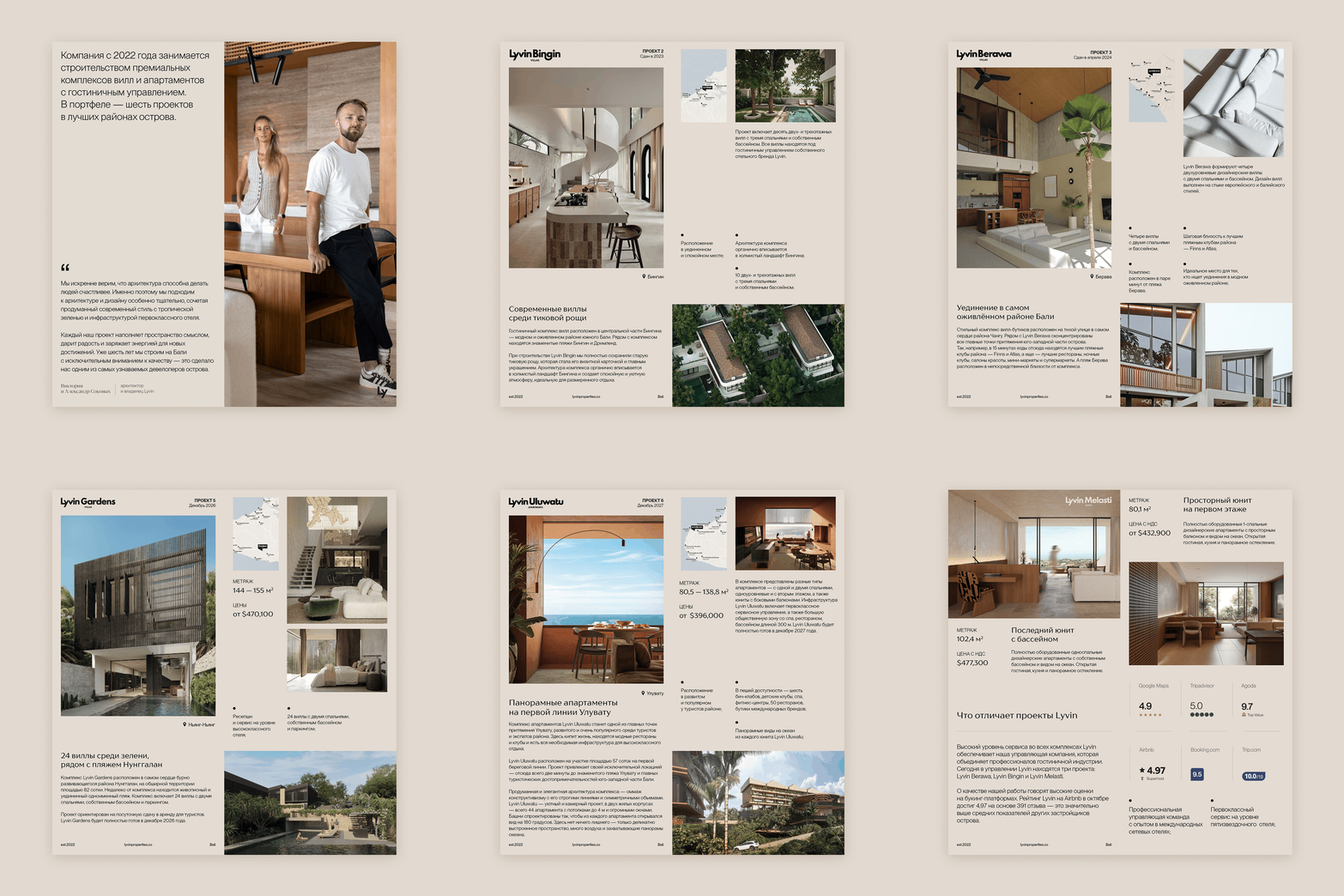
Lyvin Properties needed to establish credibility in Bali’s competitive luxury real estate market while appealing to two distinct audiences: international investors seeking returns and villa guests expecting elevated experiences. The brand required a cohesive system that could scale across multiple property developments while maintaining premium positioning.
My approach
Working from day one, I was responsible for the visual identity, system design, and real-world applications — from initial concept to physical implementation across hospitality, navigation, events, and merchandise.
CLIENT: Lyvin Properties Indonesia
ROLE & RESPONSIBILITIES: Lead Brand & Visual Designer
INDUSTRY: Real Estate Development & Hospitality
Brand identity · Marketing collateral · Guest amenities · Environmental graphics · Merchandise collaboration
Visual Strategy
The visual style was built as a practical system, not a decorative layer. My focus was on clarity, structure, and long-term scalability across physical and digital environments.
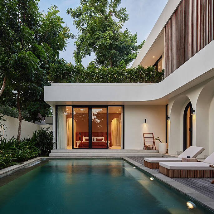
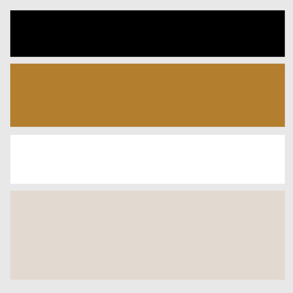
I worked with restrained typography, neutral architectural colors, and material-driven visuals to ensure the brand feels premium, contemporary, and context-appropriate for Bali — without relying on cliches.
Key principle: the identity should support architecture and product, not compete with them.
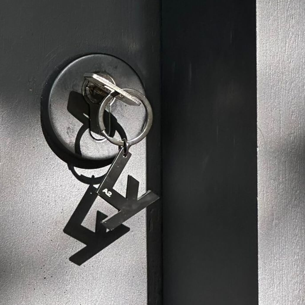
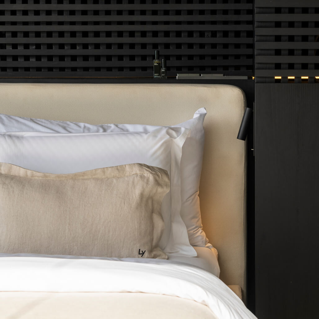
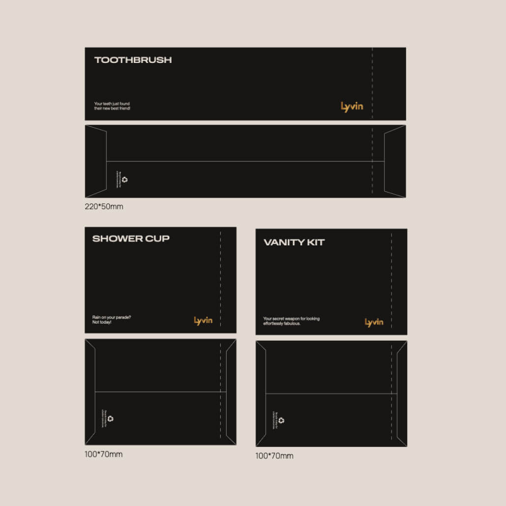
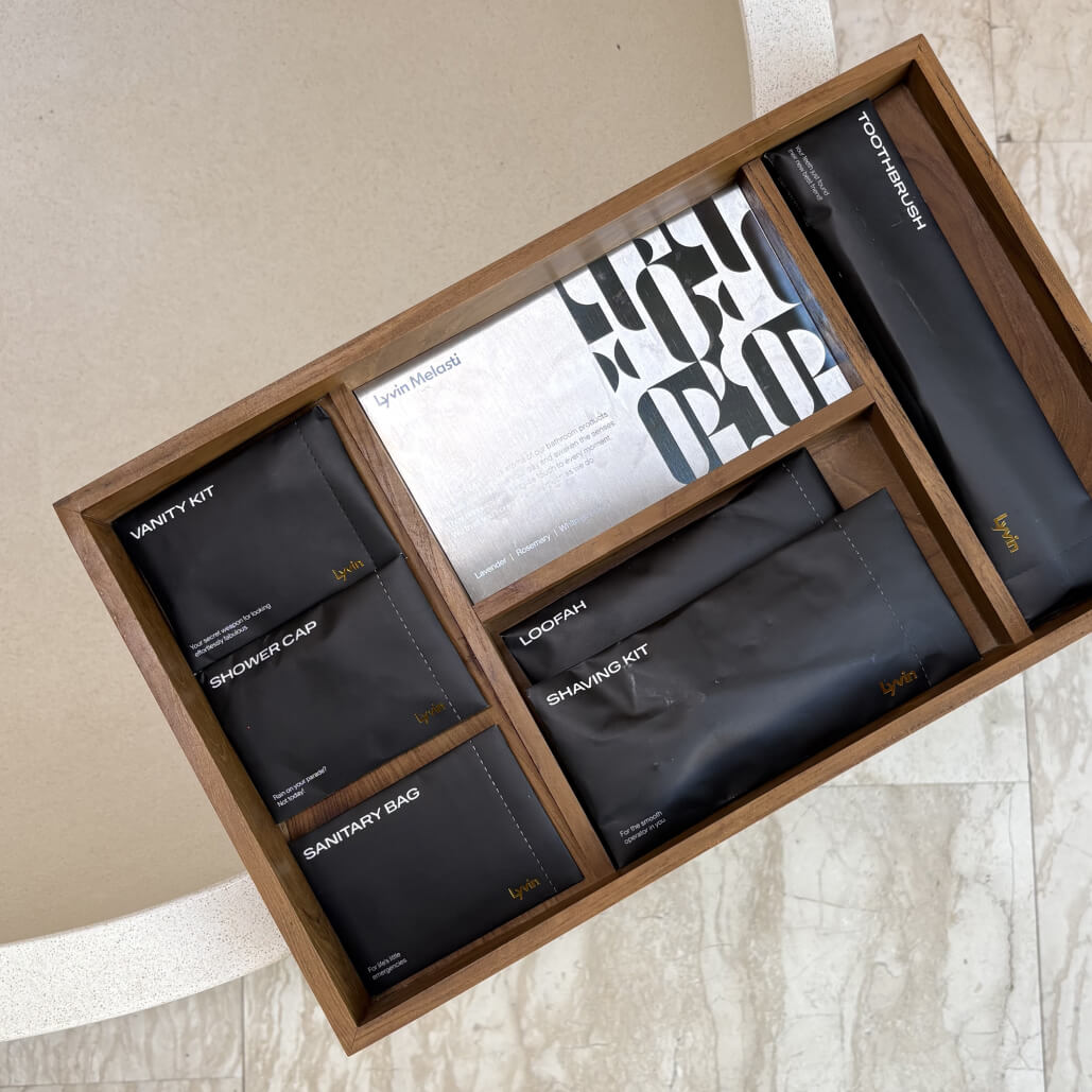
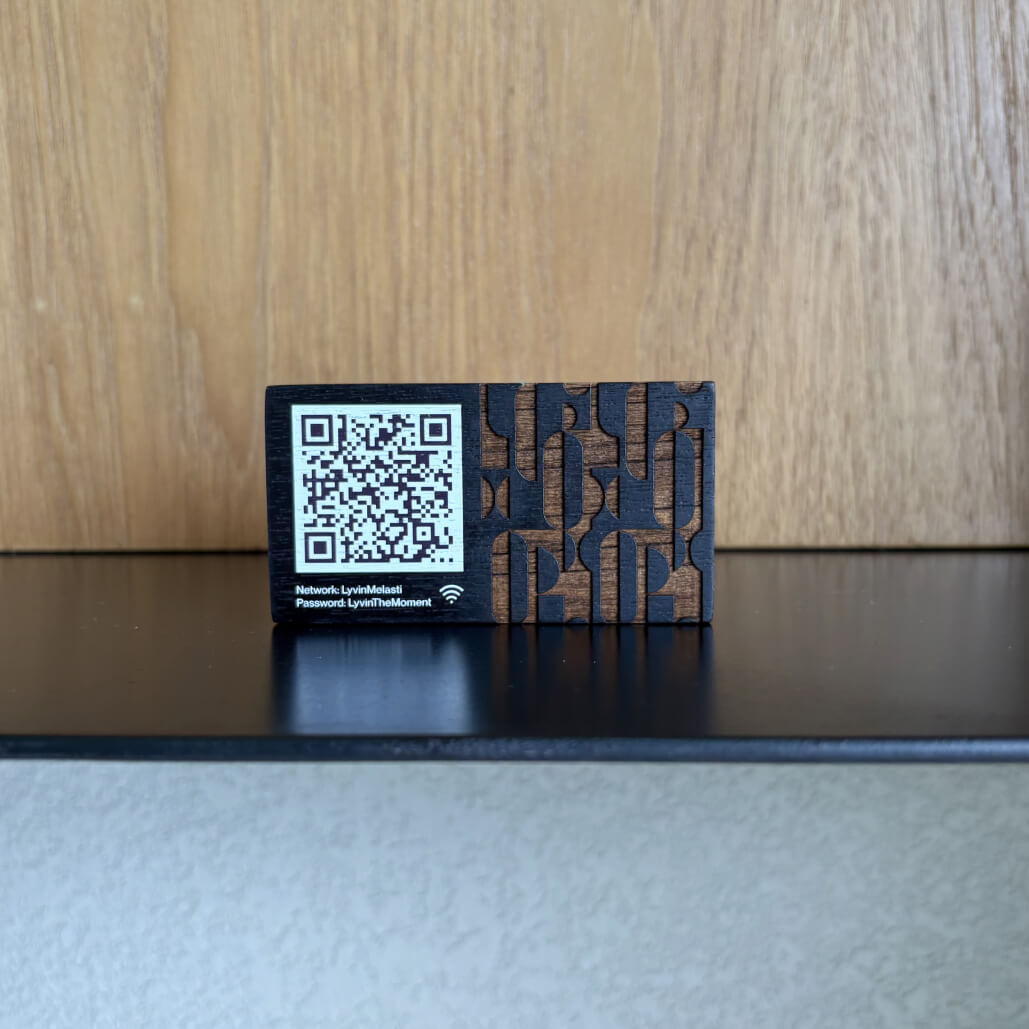
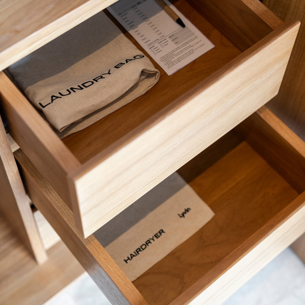
Hospitality Touchpoints
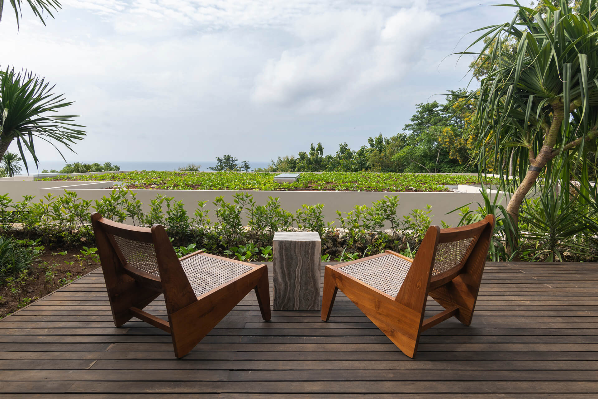
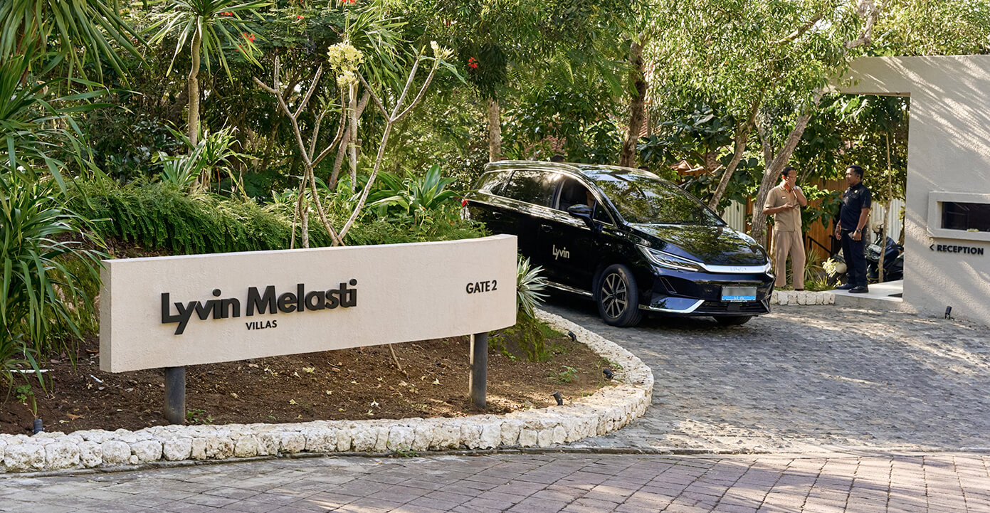
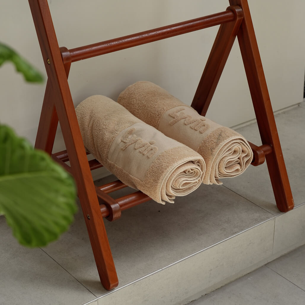
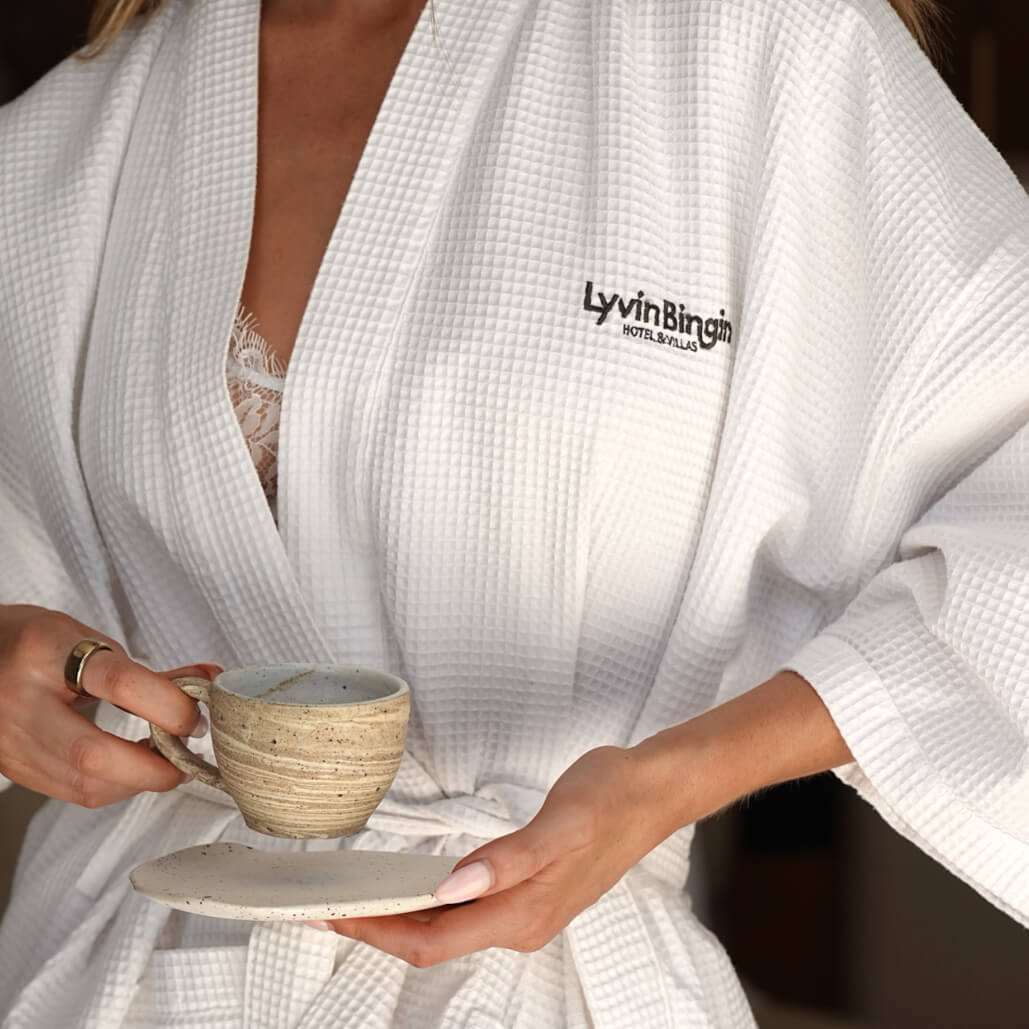
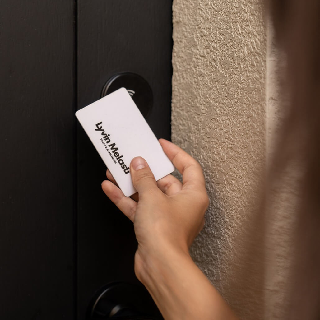
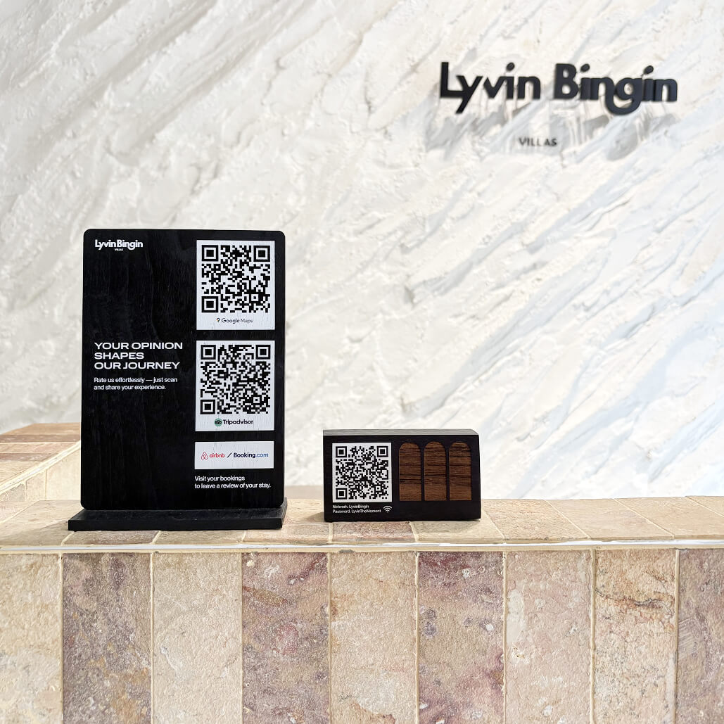
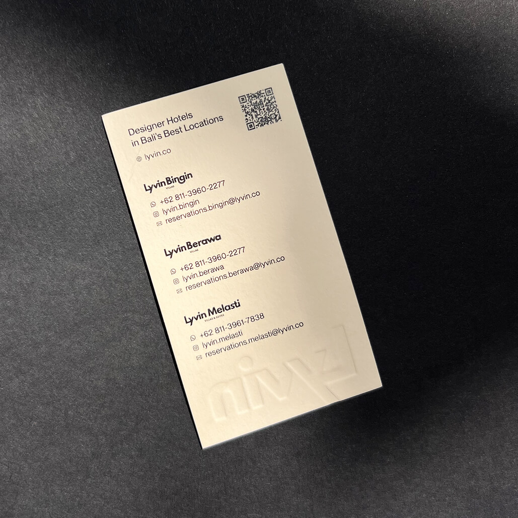
From the start, the brand was designed as a flexible system that could scale across different formats: real estate marketing, hospitality environments, navigation, events, and merchandise. The goal was to make branding feel integrated and natural within the villa environment, rather than visibly “designed.”
I focused on small but repeatable details that directly affect guest experience.
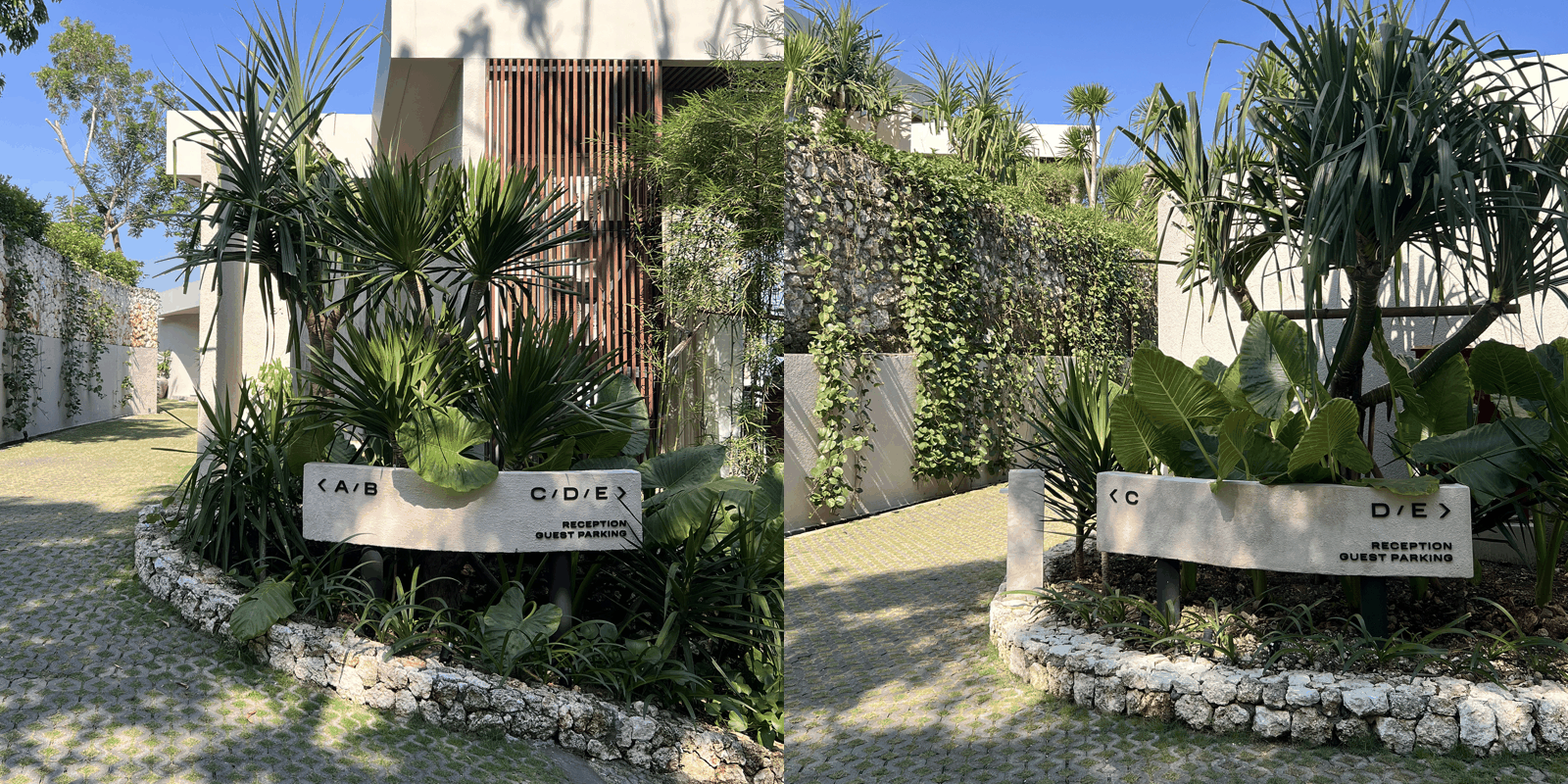
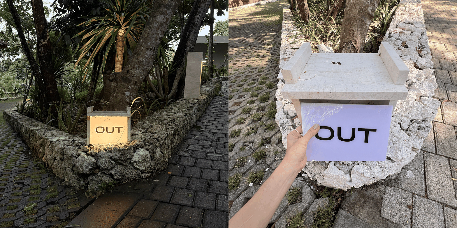
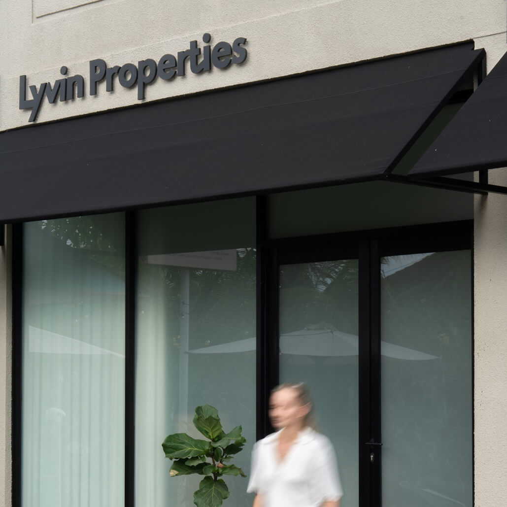
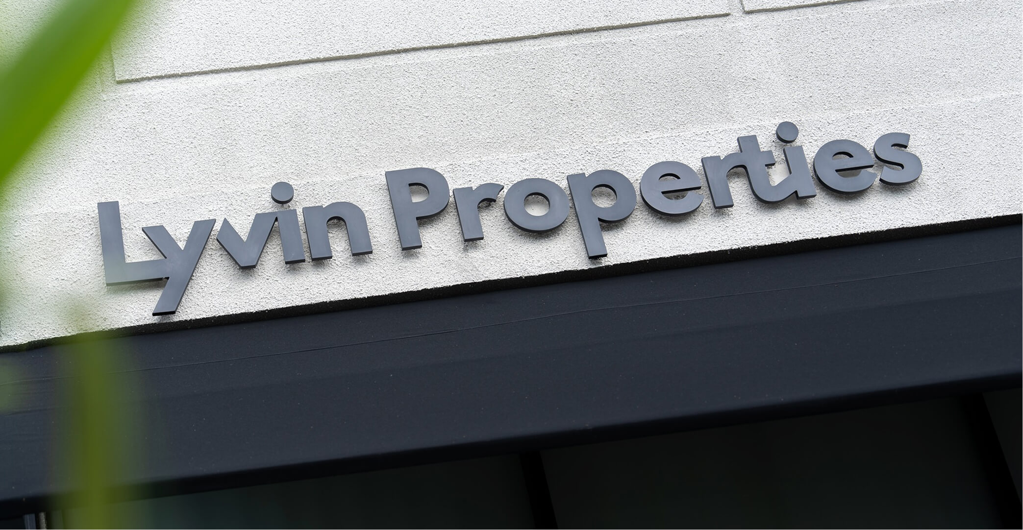
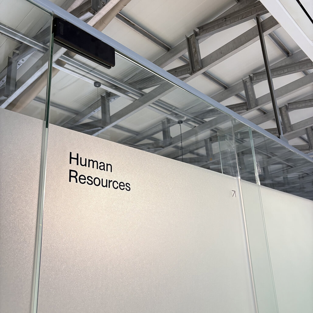
Wayfinding & Signage
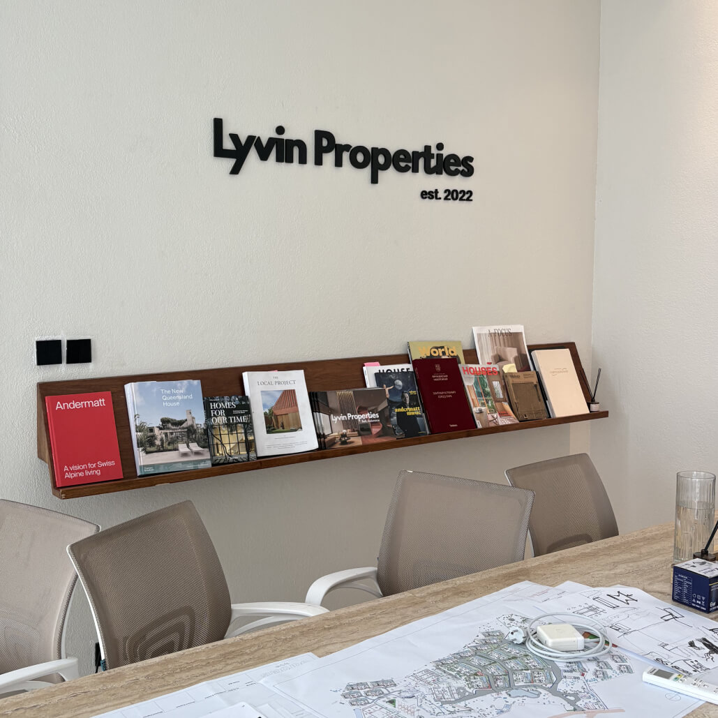
Navigation and signage were treated as part of the spatial design. I worked with minimal forms, clear typography, and material placement to ensure legibility without visual noise.
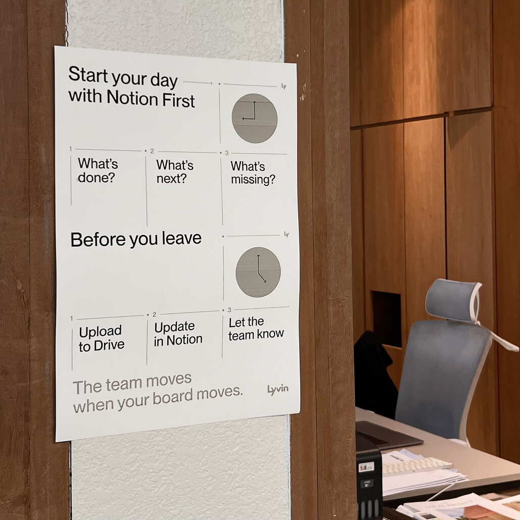
The same principles were applied to both hospitality spaces and office environments, maintaining consistency across guest-facing and operational areas.
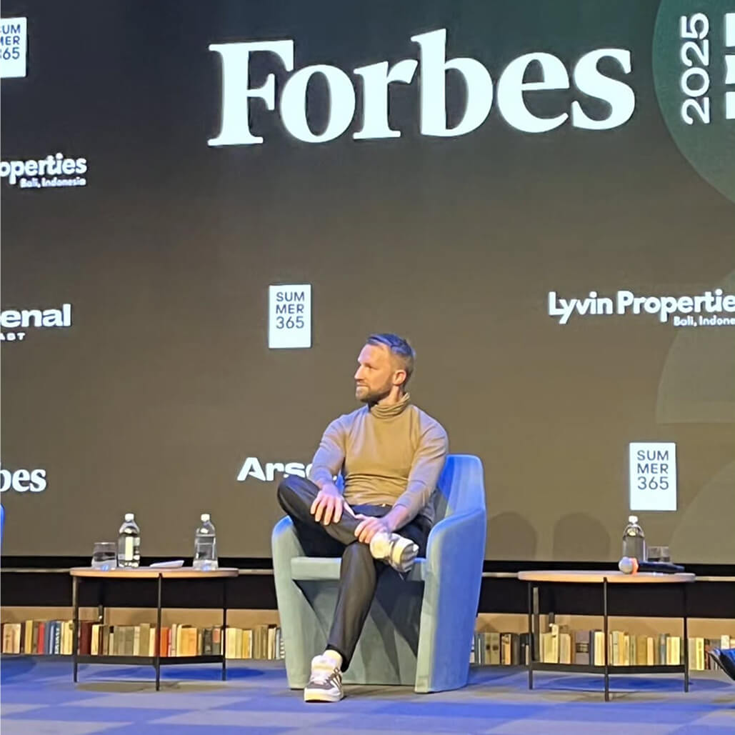
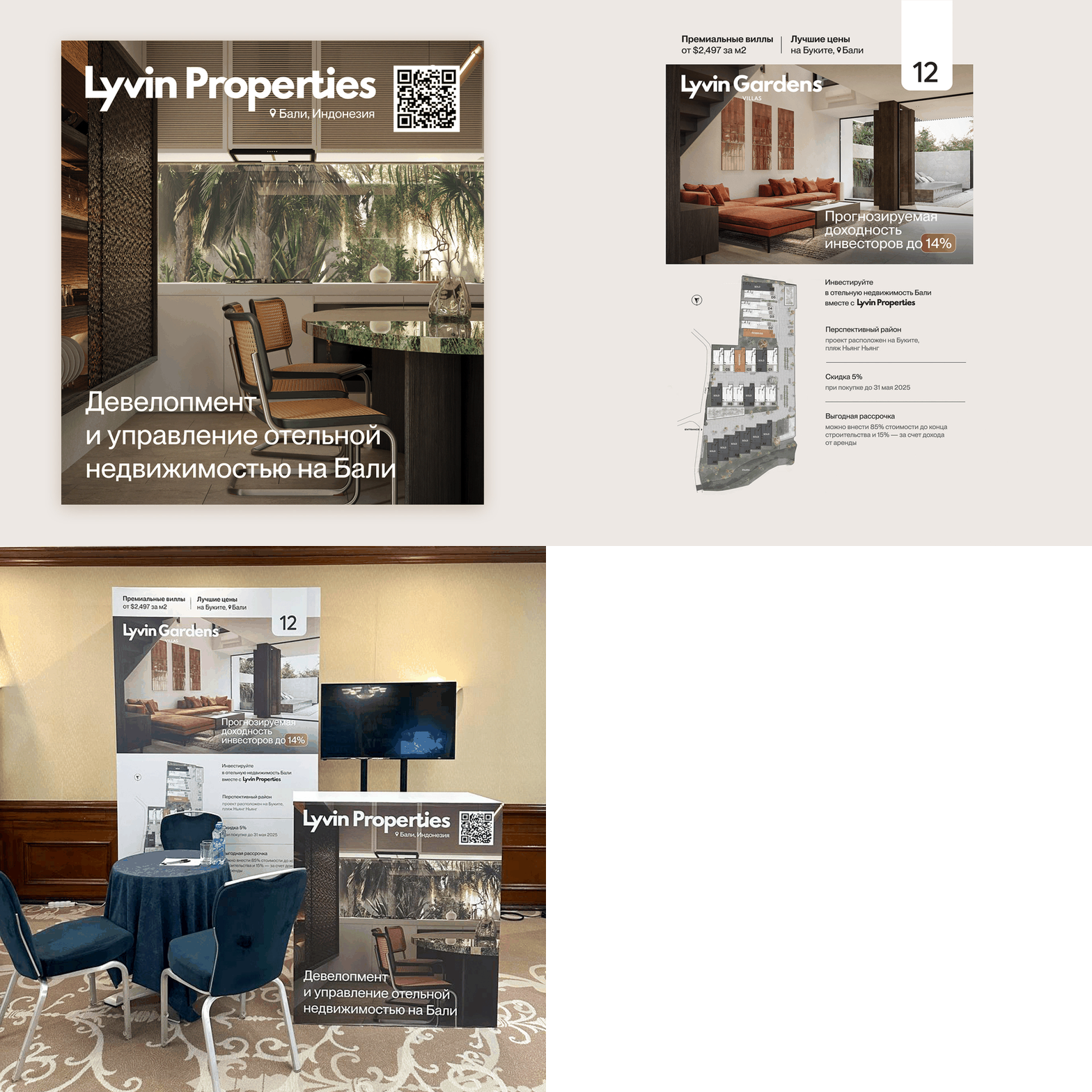
Brand Presence at Events
For exhibitions and industry events, I adapted the existing system rather than creating separate visuals. The focus was on maintaining brand continuity between digital materials, printed assets, and physical stands.
These formats were designed to communicate clarity and credibility in a short interaction window.
Merchandise production
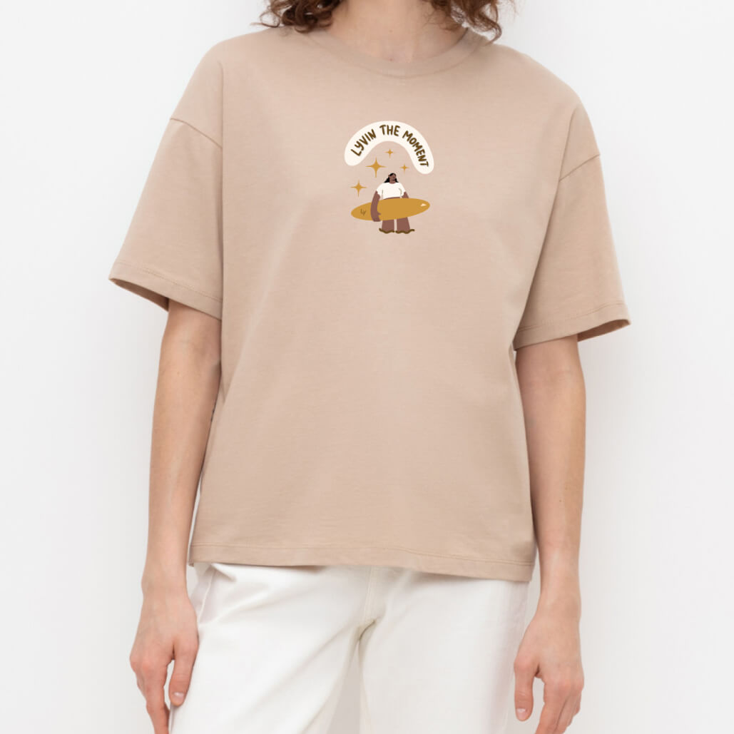
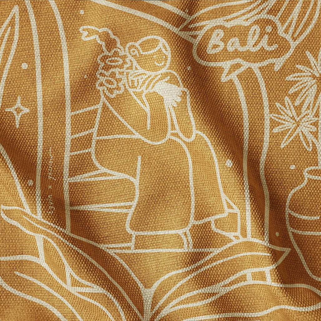
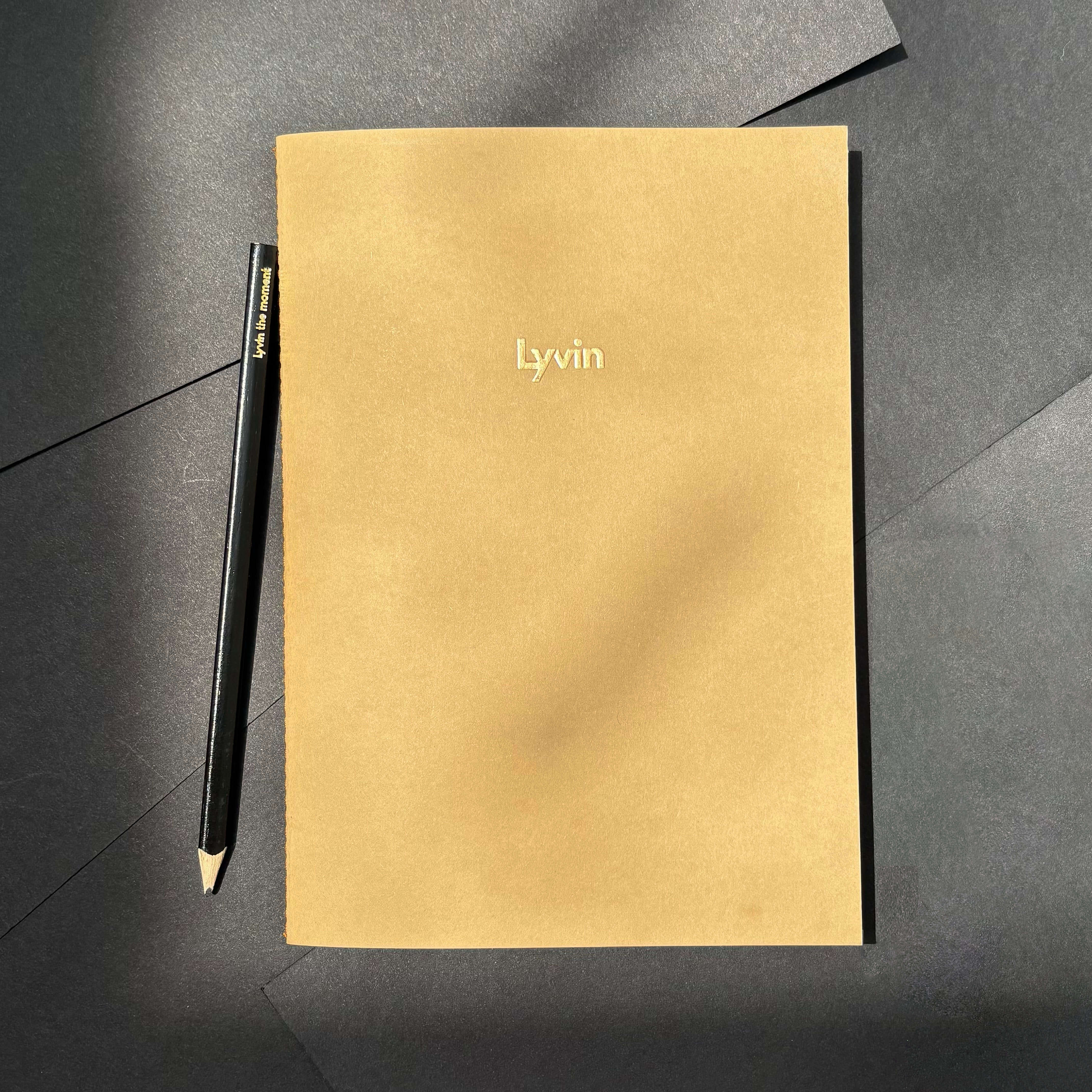
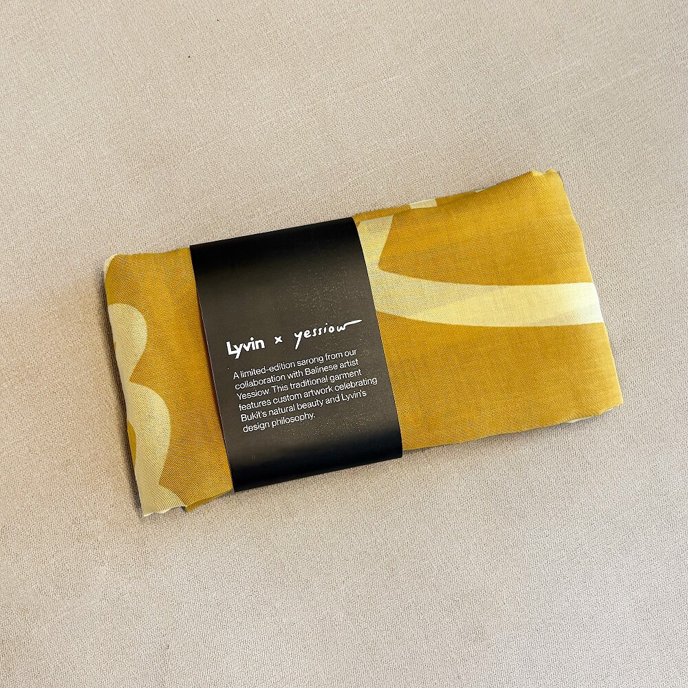
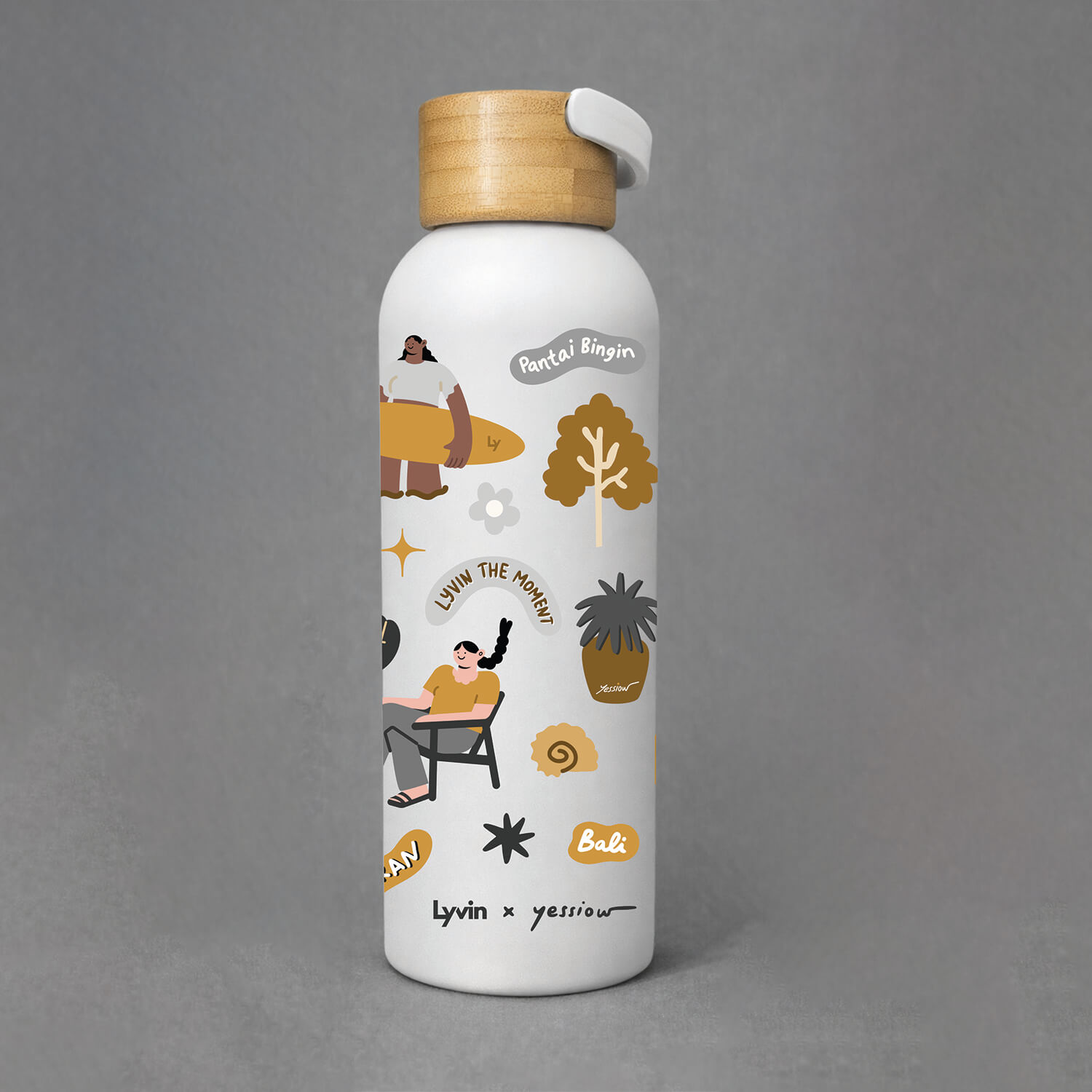
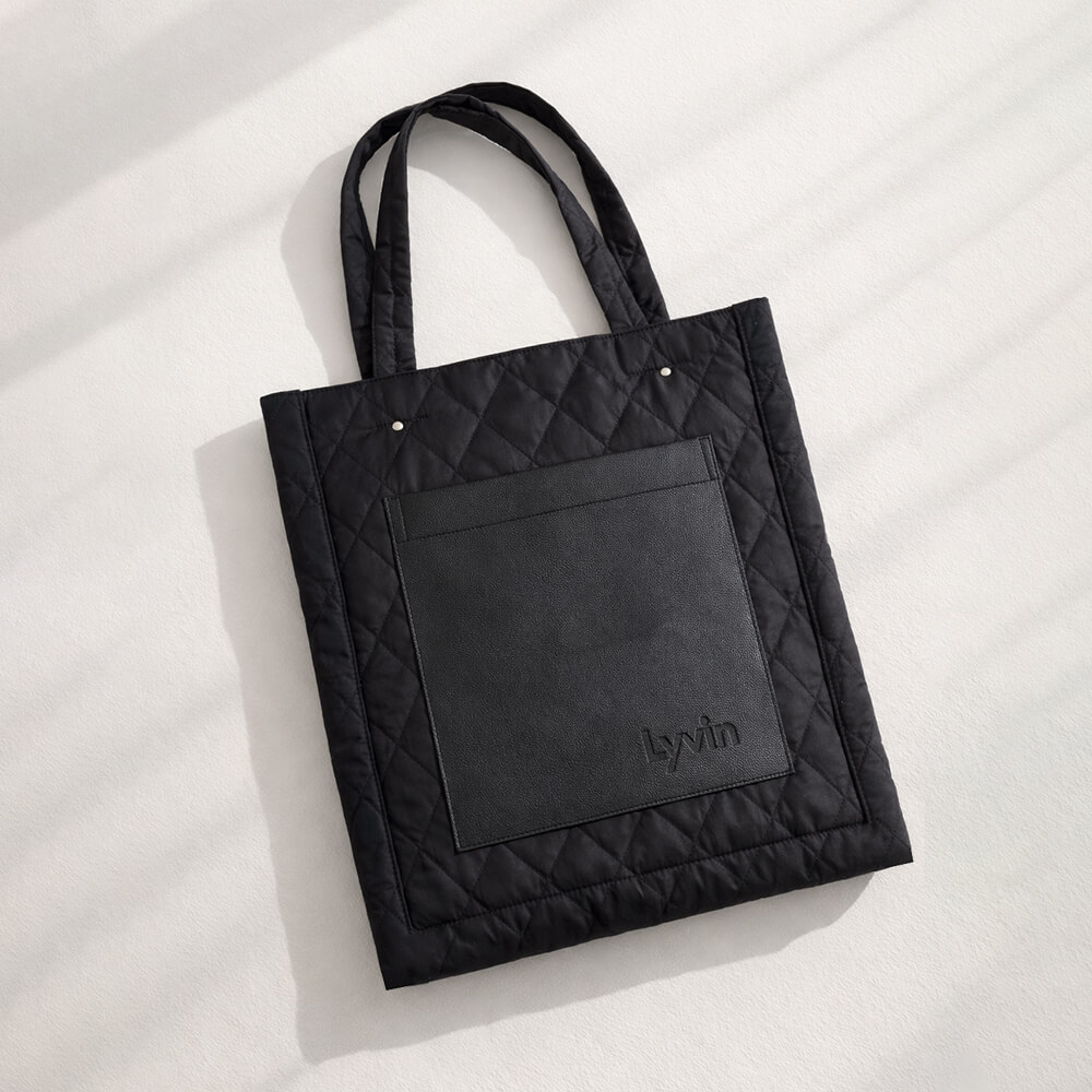
I led a merchandise program in collaboration with Yessiow artist, creating branded products that extend the Lyvin lifestyle beyond properties.
Product Range:
- For Internal / Clients: T-shirts, tote bags, tumblers, notebooks, stickers, pencils
- For Clients / Brokers: Calendars, sarongs, eyeglass cases
Outcomes
What started as a visual identity concept evolved into a fully implemented brand system across real estate, hospitality, and physical environments.
The system was successfully applied to:
- multiple property developments
- hospitality touchpoints and guest-facing details
- navigation and environmental graphics
- offline events and exhibitions
- branded merchandise
The brand remained consistent while adapting to different formats, scales, and use cases — from investor materials to on-site experiences.
Impact
The structured brand approach helped Lyvin Properties establish credibility in a highly competitive market and maintain visual consistency across both digital and physical touchpoints.
As a result:
- the brand became recognizable within its niche
- offline presence aligned with digital communication
- branded environments supported both sales and guest experience
- the system proved flexible enough to scale with new projects and formats
The identity continues to evolve alongside the business, supporting new directions without requiring a redesign from scratch.
